How to create your own font. Tips and Programs
A lot has been written about type design, especially the history of its creation. We have read about many techniques for creating fonts. But where exactly should you start? If you are a designer or illustrator and this discipline is new to you, where do you start?
We found useful information that we collected from many sources, and decided to put it all together.
1. Start with a brief
Creating a font is a long and painstaking job, so it is very important to have a clear understanding of what this font should be.
Developing a brief will certainly require research and thought. How will your font be used: will it be for a specific project or for personal use? Is there a problem your font would solve? Will your font fit into an array of similar designs? What makes it unique?
There are many options. Fonts can be created, for example, specifically for academic texts or for posters. Only when you know how your font can be used are you ready to start designing.
2. Fundamental choice
There are a number of decisions to keep in mind. Will it be sans-serif or serif? Will it be based on handwriting or will it be more geometric? Will the font be made for text and suitable for long documents? Or maybe it will display text in a creative style and look better in large size?
Clue: It is assumed that the design of sans serif font is more difficult for beginners, since the possibilities of such fonts are more specific.
3. Pitfalls in the early stages
There are several pitfalls:
- You may decide to start by computerizing handwriting, which can be a useful practice exercise. But because handwriting is so individual, your typeface might not do well because of its specificity.
- You should not take existing fonts as a basis. Reworking a font that is already familiar to everyone a little, you will not create a better font and will not develop your skills.
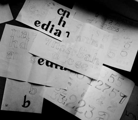
4. Use your hands
There is a lot of material on how to draw fonts with computer programs, but we strongly recommend that you first draw it by hand. Trying to do this on a computer will make your job much more difficult.
Try to create beautiful shapes of the first few letters on paper, and only then start computer work. Subsequent letters can then be constructed from existing shapes, according to key features.
Clue: By hand, you can usually draw smoother, more precise curves. To make it more convenient, don't be afraid to turn the sheet of paper the way you want.
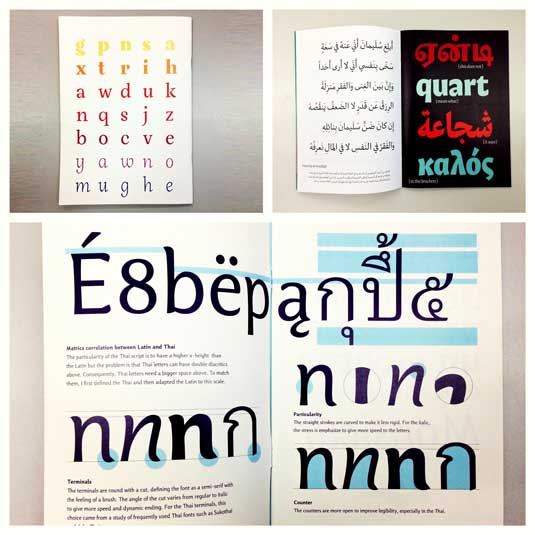
5. What characters to start with
Creating certain characters first can help you style your font. Well, then these characters will be used as guides. Usually “control characters”, as they are called, in Latin are n and o, and capital ones are H and O. Often the word adhension is used, which will help test the basic proportions of the font (but, some write this word as adhencion, because the letter s can be very tricky).
6. We transfer the font to the computer
There are many ways to transfer a drawing to a computer. Some recommend tracing programs, but many prefer to do this work manually so that they have full control over the points and shapes.
Many programs need a clear and bright drawing, so once you like your font, circle it with a fine pen and fill in the shapes with a marker.
Clue: If you have processed the drawn font as described above, then you can simply take a photo of the drawing and work with it.
7. Program selection
Many designers like to use Adobe Illustrator. For drawing individual shapes and experimenting, it is great. But later it becomes obvious that it is not suitable for creating fonts. You'll want to work with a program that lets you work with letter spacing and create words.
A great program is FontLab Studio, but newer software like Glyphs and Robofont are getting more and more popular. These programs are not cheap, but Glyghs has a “mini” version in the Mac App Store with some missing features, which is not good because those features are important for newbies.
8. Use of programs
Don't forget to position the extreme points of the letter shapes (top, bottom, right, left) to better control the process.
9. Words
When you have finished all the smoothing of the shapes, see how it looks in full text. Make it your goal to analyze how the font looks in a line, paragraph, and so on. And don't wait until you make the whole alphabet.
One of the most popular font design software. Available on Windows and Mac.
The program is available on Windows, has an intuitive interface and is great for beginners.
Another powerful font editor from FontLab that allows you to create new fonts or modify existing ones. Available on Windows and Mac.
This program runs on Windows, Mac, Unix/Linux and has been translated into many languages. It also allows you to create new fonts and edit existing ones.
OpenType font editor, available on Windows and Mac OS X. Quite simple and contains a fair amount of features.
Another free tool with which you can create dot fonts.
A free trial ($9 per font download) online tool that lets you create fonts from handwritten text.
Another online tool (also almost $10 to download) that lets you create a font from handwritten text.
A free and fairly powerful font editor. Great for beginners and those who do not want to spend money on buying programs.
This app is available on iPad and Windows 8. It allows you to create a font from a sketch and edit existing fonts.
Free limited time tool. With it, you can create fonts and download them.
A free online tool that allows you to create TTF and OTF fonts from handwritten text.
There is a free and premium version. The program runs on Windows, Linux, Mac OS X and BSD.