List of components for displaying graphic information. Using Delphi's Graphical Capabilities A Brief Background on Theory
"Displaying Graphical Information in Delphi"
Topic plan:
1. Graphic output methods
information in Delphi.
2. Displaying pictures.
3. Geometric display
figures.
There are several ways in Delphi
output of graphic information:
Conclusion of pre-prepared
images (Image components,
shape);
Construction of graphs and charts
(Chart component, etc.);
Imaging
programmatically(an object
Canvas). 2. Displaying pictures.
Displaying pictures using
the Image component we discussed in
one of the previous threads.
Here we will look at an example
implementation of the simplest animation
by periodic change
displayed picture in
Image components.
Go to example.
Display of protozoa
geometric shapes on the form
provides the Shape component. 3. Display of geometric shapes.
The main properties of the Shape component:
Brush
Pen
shape
Color (.Color) and style (.Style) for
filling in the shape.
Color (.Color), Style (.Style), Width
(.Width) and output method (.Mode) of lines
figures.
Type of geometric figure. 3. Display of geometric shapes.
From Multiple Shape Components
You can create simple drawings.
Programmatically changing the position
(.Left, .Top) size (.Width, .Height) and
the color (Brush.Color) of the Shape components
in the figure, you can
simple animation elements.
Consider an example. 4. Construction of graphs and charts.
Charts are for
more visual presentation
arrays of numerical data, their
visual display and analysis.
Example.
For charting in Delphi
there are several components
one of them is the Chart component (section
TeeChartStd. 4. Construction of graphs and charts.
View of the Chart component after it
settings on the form: 4. Construction of graphs and charts.
In addition to the Object Inspector, access to
properties of the Chart component, you can
get by opening a special window
dialog (right button on the component \
Edit Chart...)
Add
data series
Change type
diagrams 4. Construction of graphs and charts.
Chart type selection: 4. Construction of graphs and charts.
Setting properties for coordinate axes
(Axis): 4. Construction of graphs and charts.
The data to display is usually
are transferred to Chart programmatically,
example:
Series1.Clear; (clear series)
for i:=1 to N do
Series1.addxy(i, A[i], '', clGreen);
Value by
X axis
Value by
Y axis
Signature
X axis
Data color
on the diagram
Consider an example of building
graph of the function y = Sin(x) Further:
Laboratory work № 13.1.
"Displaying pictures and geometric
figures, their animation.
Exercise:
1) Develop application for implementation
the simplest animation by periodic
change the displayed picture in
Image components. (The number of pictures is not
less than three, pick up pictures
on one's own). Exercise:
2) Come up with and draw a picture from
Shape components. Programmatically
changing position, size or color
Shape components in the drawing
implement elements of the simplest
animations. Further:
Laboratory work No. 13.2.
"Building Graphs and Diagrams".
Exercise:
1) Modify the app from
Lab #9 (Displaying
data in the table). Add Opportunity
displaying some data from a table
on a bar or pie chart.
2) Construct a graph of a given function.
To display graphical information in the Delphi library, components are provided, a list of which is given in Table. 6.
Table 6
Components for displaying graphical information
| Component | Page | Description |
| Image (image) | Additional | Used to display graphics |
| PaintBox (window for drawing) | System | Used to create an area on the form in which you can draw |
| DrawGrid (drawing table) | Additional | Used to display non-text data in rows and columns |
| Chart (charts and graphs) | Additional | The component belongs to the TeeChart family of components that are used to create charts and graphs |
| Chartfx (charts and graphs) | ActiveX | Chart and graph editor |
| FIBook ( excel pages) | ActiveX | Component for input and processing of numerical information |
| VtChart (Charts) | ActiveX | Diagram window |
In addition, you can display and enter graphical information on the surface of any window component that has the property Canvas- canvas.
Image tables - DrawGrid and StringGrid components
Component DrawGrid used to create a table in an application that can contain graphics. This component is similar to the component String Grid, since the latter is derived from drawgrid. Therefore, in DrawGrid all properties, methods, events of the component are present String Grid, other than those related to the text, i.e. apart from properties Cells, Cols, Rows, Objects. From this point of view, the component StringGrid has much more potential than drawgrid, because it can store both images and texts in cells. And if you want to enter text into some cells drawgrid, then you will need to use methods for outputting text to the canvas for this, which is not very convenient.
Components DrawGrid and StringGrid have a canvas Canvas, where images can be placed.
There is a method cell rect, which returns the area of the canvas allocated for the given cell. This method is defined as
function CellRect(ACol, ARow: Longint): TRect;
where ACol and ARow- column and row indices, starting from 0, at the intersection of which the cell is located. The area returned by this function is the area of the canvas in which the desired image can be drawn. For example, the operator
DrawGridl.Canvas.CopyRect(DrawGridl.CellRect(1,1),
BitMap.Canvas,Rect(0,0,BitMap.Height,BitMap.Width));
copies by method CopyRect to cell (1,1) of the table DrawGridl image from component bitmap. This cell is second from the left and second from the top in the table because indexes start at 0. Note that if the cell dimensions are smaller than the size of the copied image, then only the left cell will appear in the cell. top part images.
Component canvas image DrawGrid and StringGrid as on the canvas of any component, it is subject to erasure when the application window is overlapped by other windows or, for example, when the application is minimized.
A convenient way to enter images into cells DrawGrid is to use an event handler OnDrawCell. These events occur for each table cell at the moment of its redrawing. The handler header looks like this:
procedure TForml.DrawGridlDrawCell(Sender: TObject;
ACol, ARow: Integer; Rect: TRect; State: TGridDrawState)
Parameter State indicates the state of the cell. It is a set that can contain the following elements: gdSelected- highlighted cell gdFocused- the cell that is in focus, gdFixed- a cell in a fixed area of the table. Parameter State can be used to display cells differently in different states.
Shape Component
Shape Component can only conditionally be attributed to the means of displaying graphic information, since it simply represents various geometric shapes, suitably shaded. The main property of this component is shape(form), which can take the following values:
StRectangle - a rectangle;
StSquare - square;
StRoundRect - a rectangle with rounded corners;
StRouhdSquare - square with rounded corners;
StEllipse - ellipse;
StCircle - a circle.
Another essential property of the component is Brush(brush). This property is an object of type tbrush, having a number of sub-properties, in particular color (Brush.Color) and style (Brush Style) shape fill. You can see the fill at some Style values in Fig. 3.2. The third of the component's specific properties shape- Pen(pen) that defines the line style.
Chart Component
Now consider the component Chart. This component allows you to build various charts and graphs that look very impressive. Component chart has a lot of properties, methods, events, so if you consider all of them, then you would have to devote an entire chapter to this. Therefore, we confine ourselves to considering only the main characteristics Chart. And the rest you can find in the built-in Delphi help or just try them out by experimenting with diagrams.
Component chart is a container of objects Series- class descendants TchartSeries. Each such object represents a series of data characterized by a certain display style: one or another graph or chart. Each component chart may include several series. If you want to display a graph, then each series will correspond to one curve on the graph. If you want to display charts, then for some types of charts, you can overlay several various series, for others (like pie charts) it will probably look ugly. However, in this case, you can set for one component chart multiple series of the same data with different chart type. Then, by making one of them active at each moment of time, you can give the user a choice of the type of chart that displays the data of interest to him.
Place one or two components chart on the form and look at the properties that open in the Object Inspector. Let us explain some of them.
AllowPanning - determines the user's ability to scroll the observed part of the chart during execution by pressing the right mouse button. Possible values: pmNone - scrolling is disabled, pmHori/ontal, pm Vertical or pmBoth - respectively, scrolling is allowed only in the horizontal direction, only in the vertical direction, or in both directions.
AhowZoom - allows the user to change the image zoom at runtime by cutting out fragments of a chart or graph with the mouse cursor. If the fragment frame is drawn to the right and down, then this fragment is stretched to the entire chart field. And if the frame is drawn up and to the left, then the original scale is restored.
Title - defines the title of the chart.
Foot - defines the caption under the chart. None by default. The label text is defined by the Text subproperty.
Frame - defines the frame around the chart.
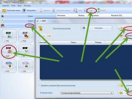
Next to many of the listed properties in the Object Inspector, there are buttons with ellipsis that allow you to call one or another page of the Chart Editor - a multi-page window that allows you to set all the properties of charts. Calling the Diagram Editor is also possible by double-clicking on the component chart or click on it right click mouse and selecting the Edit Chart command from the pop-up menu.
Double click on the top component Chart. You will be taken to the Chart Editor window to the Chart page, which has several tabs. First of all, you will be interested in the Series tab on it. Click on the Add button - add a series. You will be taken to a window where you can select the type of chart or graph. In this case, choose Pie - a pie chart. Using the Titles tab, you can set the title of the diagram, the Legend tab allows you to set the display options for the diagram legend (list of symbols) or remove it from the screen altogether, the Panel tab determines the appearance of the panel on which the diagram is displayed, the 3D tab allows you to change the appearance of your diagram: tilt, shear, thickness, etc.
When you are working with the Chart Editor and have selected a chart type, the components chart your form displays its appearance with conditional data entered into it. Therefore, you can immediately observe the result of applying various options to your application, which is very convenient.
The Series page, which also has a number of tabs, allows you to select additional display characteristics for the series. In particular, for a pie chart on the Format tab, it is useful to enable the Circled Pie option, which will ensure that the chart is displayed as a circle at any size of the Chart component. On the Marks tab, the Style group buttons determine what will be written on the labels related to individual chart segments: Value - value, Percent - percentages, Label - data names, etc.
You can, if you wish, add another identical series to this Chart component by clicking the Clone button on the Series tab of the Chart page, and then for this new series, click the Change button and select a different chart type, such as Bar.
Exit the Chart Editor, select the lower Chart component in your application, and repeat setting properties for it using the Chart Editor. In this case, you will need to specify two series if you want to display two curves on the chart, and select the Line chart type. Since we are talking about graphs, you can use the Axis and Walls tabs to set the coordinate characteristics of the axes and three-dimensional faces of the graph.
On this design appearance application ends. It remains to write the code that specifies the data that you want to display. For the test application, let's just define some constant data in the pie chart and some functions in the graphs.
To set the displayed values, use the Series methods. Let's focus on three main methods.
Method Clear clears the series from previously entered data.
Method Add:
Add(Const AValue:Double; Const ALabel:String; AColor:TColor) ,
allows you to add a new point to the chart. Parameter AValue corresponds to the added value, parameter ALabel- a label that will be displayed on the chart and in the legend, AColor- color. Parameter ALabel- optional, it can be set empty: ‘ ’. Method AddXY:
AddXY(Const AXValue, AYValue: Double; Const ALabel: String; AColor: TColor)
allows you to add a new point to the function graph. Parameters AXValue and AYValue match the argument and function. Parameters ALabel and AColor the same as in the method Add.
Thus, the procedure for loading data in our example may look like:
constAl=155; A2=251; A3=203; A4=404; var i:word; begin
With Seriesl do begin
Add(Al,"Shop l",clYellow);
Add(A2,"Design 2",clBlue);
Add(A3,"Floor 3",clRed);
Add(A4,"Design 4",clPurple); end;
Series2.Clear; SeriesS.Clear; for i:=0 to 100 do begin
Series2.AddXY(0.02*Pi*i,sin(0.02*Pi*i)
SeriesS.AddXY(0.02*Pi*i,cos(0.02*Pi*i) end;
ClRed); ,clBlue);
Operators Clear are needed if you are going to update the data during the operation of the application.
This concludes our introduction to the component. Chart. True, we considered only a small part of its capabilities.
Description of the presentation on individual slides:
1 slide
Description of the slide:
2 slide
Description of the slide:
medium of the visual Delphi programming, like Windows, supports a graphical user interface (GDI - Graphic Delphi Interface). There are two ways to display graphical information in Delphi: output of pre-prepared images; drawing from the program.
3 slide
Description of the slide:
The first method is based on using the Image and Shape components. You can use a ready-made picture (pictogram) or create them yourself using the Image Editor. The second way is to generate images programmatically using the Canvas object.
4 slide
Description of the slide:
Delphi has at its disposal a special object, which is formatted as a Canvas property. It is only available while the application is running, so it can only be controlled from within the program by writing desired code in the Object Pascal language. If an object has a Canvas property, you can draw on its surface. The most suitable candidates for this role are the form itself and the special PaintBox component.
5 slide
Description of the slide:
Canvas Object Properties: Pen (Feather) - property for drawing lines and borders of geometric shapes. The pen follows the commands of the graphic cursor and, in turn, has its own nested properties: Color - defines the color of the line (black by default); Mode - drawing style (has many values that are not given here); Style – line style, which can take the following values: psSolid – solid (by default); psDosh - dashed line; psDot - dotted line; psDoshDot - dotted dash (and other properties); Widh - line thickness (default 1 pixel);
6 slide
Description of the slide:
Brush (Brush) - a property for filling shapes that have the following nested properties: Color - brush color (default - white); Style - brush ornament, which can take the following values: bsClear - solid coloring; bsHorizontal - horizontal lines; bsVertical - vertical lines; bsFDiagonal - left diagonal lines; bsBDiagonal - right diagonal lines; bsCross - cell; bsDiagCross - oblique cell;
7 slide
Description of the slide:
Font (Font) - a property for displaying text, which has the following nested properties: Color - the color of the characters; Height - font height in pixels; Name – font name; Size - font size; Style - font style, which can take the following values: fsBold - bold; fsItalic - italic fsUnderline - underlined fsStrikeOut - crossed out;
8 slide
Description of the slide:
PenPos (Pen position) - a property for storing the current drawing position (defines the position of the pen in the drawing area in this moment time); Pixels - array property for writing and reading the coordinates of individual points of the drawing area ("canvas").
9 slide
Description of the slide:
Methods of the Canvas object MoveTo(x,y: integer) – moves the pen from the current position to the point with the given x, y coordinates without drawing a line; LineTo(х.у: integer) - moves the pen from the current position to the point with the given x, y coordinates, drawing a line; Arc(x1, y1, x2, y2, x3, y3, x4, y4: integer) - draws an arc of an ellipse inscribed in a rectangle with coordinates (x1, y1) and (x2, y2). The arc is determined by the radii of the ellipse passing through the points (x3, y3) and (x4, y4);
10 slide
Description of the slide:
Chord(x1, y1, x2, y2, x3, y3, x4, y4: integer) – draws an ellipse chord as described for the Arc method; Ellipse(x1, y1, x2, y2: integer) - draws an ellipse inscribed in a rectangle with the upper left corner at the point (x1, y1) and the lower right corner at the point (x2, y2); FillRect (Rect (x1, y1, x2, y2: integer)) - fills the rectangle with the color specified in the current brush (Brush). Uses the Rect function, which represents a rectangle at the given coordinates;
11 slide
Description of the slide:
FloodFill(x,y: integer; Color: TColor; FillStyle: TFillStyle) - filling with the current color specified in the Brush property: with FillStyle=fsBorder - a closed area from the point with x, y coordinates to the border defined by the Color color; with FillStyle=fsSurface – that area of the surface that has the color Color; Pie(x1, y1, x2, y2, x3, y3, x4, y4: integer) - draws a sector of an ellipse inscribed in a rectangle with coordinates (x1, y1) and (x2, y2). The sector is defined by two ellipse radii passing through the points (x3, y3) and (x4, y4);
12 slide
Description of the slide:
Polyline (Points: array of TPoint) – draws a polyline by sequentially connecting the points of the Points array; Polygon (Points: array of TPoint) - draws polygons by sequentially connecting the points of the Points array. It differs from the Polyline method in that it automatically connects the end of the polyline to its beginning; Rectangle (x1, y1, x2, y2: integer) - draws a rectangle with the upper left corner at the point (x1, y1) and the lower right corner at the point (x2, y2);
13 slide
Description of the slide:
Retresh – the method is called when the image needs to be redrawn; RoundRect (x1, y1, x2, y2, x3, y3: integer) - Draws a rectangle with rounded corners. The corners are drawn as quarters of an ellipse with x3 width and y3 height; TextOut (x, y:integer, Text:String) - output the text specified in the Text parameter. The text fits into a rectangle whose upper left corner has x, y coordinates.
The Visual Component Library (VCL) Delphi provides us with the following visual components for displaying graphic information: Image (image), PaintBox (drawing window), DrawGrid (picture table), Chart (diagrams and graphs), Animate ( output video clips), as well as Form. These components have a Canvas property (described above) that gives access to each pixel. Of course, you don't have to draw pixel by pixel to work with graphics in Delphi, the Delphi system provides powerful tools for working with graphics.
Let's take a closer look at the above components:
Image component (image)
It is an object of the TImage class. Used to display images read from graphic files. By default, it displays on the surface of the form images presented in *.bmp format. To display images in jpg format, you need to include the JPEG module in the uses directive. It is located in the Additional tab of the Component Palette.
After placing the Image component on the form, it takes the form of a selected rectangular area.
Figure 9 - Image component on the form
To open a dialog to select the desired image, do the following using the Object Inspector. To do this, find the Picture property and click on the three dots to the left of it. The Picture Editor window opens and select Load in it, in the window that opens, select the image file.
This can also be done programmatically by calling the LoadFromFile method of the Picture property:
Image1.Picture.LoadFromFile("name_pic.jpeg") ;
where name_pic.jpeg is the name of the file.
Table 8 - Main properties of the Image component
|
Property |
Description |
|
|
Image displayed in the component field |
||
|
Component dimensions. If these dimensions are smaller than the illustration size, and the Strech, AutoSize, and Proportional properties are set to False, then part of the image is displayed |
||
|
Allows you to automatically scale pictures without distortion. To perform scaling, the value of the AutoSize property must be False |
||
|
Allows you to automatically scale (compress or stretch) the image according to the size of the Image component. If the size of the component is not proportional to the size of the image, then the image will be distorted. |
||
|
Allows you to automatically resize a component to match the size of the image |
||
|
Allows you to determine the position of the image in the field of the Image component horizontally, if the width of the image is less than the width of the component. |
||
|
Surface for displaying graphics |
||
|
Indicates transparent color image background |
Example 1: Write an image viewer using the Image component. The program must have the following features:
- view images in a folder;
- View the image in full size or in the format most suitable for the size of the window;
- · manage image files, as well as print, save, delete and modify images;
- if necessary, open the image in the editing program;

Figure 10 - Program window before its launch
Project creation:
- 1. Create a folder for the program files and launch the Delphi integrated development environment.
- 2. Add components to the form:
First, we will place the Image component on the form, the main component with which we will have to work. In addition to it, we need the following components:
- · ScrollBox It is necessary when in full-size mode the image goes beyond the Image. We assign the value alClient to its Aling property so that its dimensions change proportionally with the size of the window. And we place the Image component on it;
- · We will also add the SavePictureDialog and OpenPictureDialog dialog components for saving and opening images. We need the first one to copy the image to the selected directory, the second one - to call the open dialog graphic file. They are located on the Dialogs page of the Component Palette. From this page, we also need the PrintDialog component, which we need to call the printer selection dialog for printing.
- Let's add MainMenu to add the main menu to the program and XPManifest for more colorful design
- · We also need somewhere to store the names of the images that are in the working directory. For these purposes, the ListBox component is convenient, which can be hidden when processing the Create event of the Form1 form.
- To accommodate the navigation buttons and convenient operation with them we will add a Veil panel, on which we will place these buttons (Previous image, Next image, True Size, Fit to Size, Delete, Copy to, Print, Edit). SpeedButton is selected as a component for them.
- · Add a timer to catch pressing the keys "Left" (previous image), "Right" (next image) and the key "Del" (delete image).
- · And one more component - ProgressBar, which displays the process of loading large *.Jpg files.
- 3. Write the code for handling the button click event (Previous image, Next image, True size, Fit to size, Delete, Copy to, Print, Edit). Write the code for handling the event of clicking on the MainMenu menu items (Exit, Open, Close, Create).
- 4. Set the initial settings for creating the form. Double-click on an empty area of the form and write the procedure code procedure TForm1.FormCreate(Sender:TObject), see the module code in Appendix 1.
- 5. Write procedures of the following form:
procedure FindFileInFolder(path, ext: string);
This procedure scans the path folder for files with the mask ext.
A complete code listing of the program module is located in Appendix 1 (Program Listing 3).
- 1. List the capabilities of the Image component.
- 2. Which class object is the Image component?
- 3. 3. What file type does the Image component support by default?
- 4. 4. List the main properties of the Image component.
- 5. 5. What property stores the image of the Image component?
List of components for displaying graphic information
To display graphical information, the Delphi library provides components, the list of which is given in Table 4.1. Table 4.1 Graphic Information Display Components Pictogram Component Page Description Image (image) Used to display graphics: icons, bitmaps and metafiles. PaintBox (window for drawing) Used to create an area on the form in which you can draw. DrawGrid (drawing table) Used to display non-text data in rows and columns. Chart (charts and graphs) The component belongs to the TChart family of components that are used to create charts and graphs. Canvas Canvas is not a component, so, strictly speaking, it should not be considered within the scope of this book. But since many components, in particular, forms, have a canvas and the canvas provides the ability to display various graphic information, it is still advisable to give some initial information about the canvas. A canvas is an area of a component where you can draw or display finished images. It contains properties and methods that greatly simplify Delphi graphics. All complex interactions with the system are hidden for the user, so a person who is completely unsophisticated in computer graphics can draw in Delphi. Each point of the canvas has coordinates X and Y. The canvas coordinate system, like everywhere else in Delphi, starts at the upper left corner of the canvas. Coordinate X increases when moving from left to right, and the coordinate Y- when moving from top to bottom. Coordinates are measured in pixels. A pixel is the smallest element on the surface of a drawing that can be manipulated. The most important property of a pixel is its color. Canvas has the property Pixels. This property is a 2D array that controls the colors of the canvas. For instance, Canvas. Pixels corresponds to the color of the pixel 10th from the left and 20th from the top. An array of pixels can be treated like any property: change the color by giving the pixel a new value, or determine its color from the value stored in it. For instance, Canvas. Pixels:=0 or Canvas. Pixels :=clBlack- this is a task for a black pixel. Property Pixels can be used for drawing on canvas. Let's try to draw a pixel-by-pixel graph of a sine wave on the shape canvas. To do this, in the form event handler OnPaint(drawing) you can insert the following code: Tform1. FormPaint(Sender: TObject); var,Y: real; // function coordinates,PY: longint; // pixel coordinates begin:=clWhite; for PX:=0 to ClientWidth do (X - plot argument, :=PX*4*Pi/ClientWidth;:=Sin(X); (PY - pixel coordinate, :=trunc(ClientHeight - (Y+1) *ClientHeight/2); (Sets the color of the selected pixel (About brightness) ). Pixels:=0; end;
Run this test application and you will see the result shown in Figure 4.1 a. The sinusoid graph turned out, although not very good, because. broken down into individual dots - pixels. Canvas - class object TCanvas has many methods that allow you to draw graphs, lines, shapes using the property Pen- feather. This property is an object, which in turn has a number of properties. One of them is a property you already know color- the color with which the drawing is applied. The second property is Width(line width). The width is specified in pixels. The default width is 1. Property style defines the type of line. This property can take the following values: The canvas has a property PenPos type TPoint(cm Let's try to draw the sine graph from the previous example with a pen. In this case, the form event handler OnPaint may look like: procedure Tform1. FormPaint(Sender: TObject); var,Y: real; // function coordinates,PY: longint; // pixel coordinates begin:=clWhite;. MoveTo(0,ClientHeight div 2); for PX:=0 to ClientWidth do (X - plot argument, corresponding to the pixel with the px coordinate):=PX*4*Pi/ClientWidth;:=Sin(X); (PY - pixel coordinate, corresponding to the Y coordinate):=trunc(ClientHeight - (Y+1) *ClientHeight/2); (A line is drawn on the graph). LineTo(PX,PY); You can see the result of the application in this version in Figure 4.1 b. As you can see, the quality of the graph has improved significantly. The pen can draw not only straight lines, but also shapes. For a complete list of pen-based canvas methods, see Delphi's built-in help. In the meantime, as an example, we will give only one of them - Ellipse A that draws an ellipse or circle. It is declared as procedure Ellipse(X1, Y1, X2, Y2: Integer); where parameters X1, X2, Y1, Y2 define the coordinates of a rectangle that describes an ellipse or circle. For example, the operator Ellipse(10, 40, 20, 50); will draw a circle with diameter 10 and center coordinates (15, 45). Shapes are generally drawn not empty, but filled in using the canvas property Brush- brush. Property Brush is an object that has in turn a number of properties. Property color defines the fill color. Property style defines the fill pattern (hatching). Default value style equals bsSolid, which means solid coloring color. At the pen Pen There is one more property that we have not yet considered. This property is mode(mode). Default value Mode = pmCopy. This means that the lines are drawn in the color specified in the property color. But other modes are also possible, in which not only color is taken into account color, but also the color of the corresponding background pixels. The most interesting of these modes is the mode pmNotXor- addition with the background by inverse exclusive OR. If this mode is set, then drawing the same shape again in the same place on the canvas removes the previously drawn image and restores the pixel colors that were before the first drawing of the shape. This feature of the regime pmNotXor can be used to create simple animations. It is enough to draw something, then erase the drawing, redraw it slightly changed - and the drawing will appear to come to life. Try to make yourself a simple animation - a moving circle. Start a new app and go to section implementation insert ad X,Y: integer; This will introduce global variables X and Y- current image coordinates. In a form event OnPaint insert statements Brush. Color:=clWhite;:=clWhite;. Pen. Mode:=pmNotXor; The first of these operators sets the color of the brush to white. Brush. So your circle will be painted inside with white. The second statement sets the background color of the form's surface to white. The third statement sets the pen mode pmNotXor, which will allow you to erase the old image before drawing the new one. Even the simplest animation needs synchronization. Otherwise, the speed of movement will be determined by the speed of the computer. Therefore, transfer the component to the form timer- timer from the System. This component is described in section 5.7 You can see it there detailed description. For now, set its property Interval equal to, for example, 30 (this is the exposure time in milliseconds, but real time shutter speed will be longer - see section 5.7) and set the property Enabled equal false(this means that the timer will not start automatically when the application starts). In the event handler of this component OnTimer insert statements // Erase old image. Ellipse(X-5, Y, X+5, Y-1Q);(X); // Draw a new image. Ellipse (X-5, Y, X+5, Y-10); // Stop when the end of the form is reached if(X >= ClientWidth-20) then. enabled:=false; The first of these operators draws a circle in the place where it was drawn earlier, i.e. erases the previous image. The last statement stops the image at the edge of the form. Now add a button to the form. button and in the click handler on it place the operators X: =10;: =100;. Ellipse(X-5, Y, X+5, Y-10); enabled:=true; The first two operators set the initial coordinates of the circle. The third statement draws the circle at its start position, and the fourth one starts the timer. Translate the application, run it, click the button. You will see a circle image moving across the form from left to right. And then connect your imagination and transform this not very interesting application into something more exciting. On the canvas, you can display not only programmatically created images, but also images stored in graphic files. Only the canvas itself does not have a method for loading an image from a file. Therefore, you need to upload the file to some other graphic object, capable of perceiving the information of graphic files. And then rewrite the image from this object to the canvas using the canvas method Draw. Its description: Draw(X, Y: Integer; Graphic: TGraphic); Here parameters X and Y determine the coordinates of the upper left corner of the image placement on the canvas, a Graphic- an object that stores information. Such an object can be, for example, an object of type TBitMap, intended for storing bit matrices. Let's see how it all looks in practice. Open a new application, drag a component onto the form OpenPictureDialog from the Dialogs page (this is a component of the dialog for opening graphic files - see section 8.2 procedure Tform1. Button1Click(Sender: TObject); var:TBitMap; // Selecting a graphic file by the user if OpenPictureDialog1. Execute then // Create a BitMap object of type TBitMap:=TBitMap. create; // Transfer image to form canvas. Draw(10, 10, bitmap); // Destroy the BitMap object. free; end;
This code creates a temporary object of type TBitMap With name bitmap. Then the dialog for opening a graphic file is called. OpenPictureDialog1 and, if the user has selected a file, then it is loaded into bitmap method LoadFromFile. Then the method Draw the loaded image is copied onto the canvas in the area with the coordinates of the upper left corner (10,10). After that the temporary object bitmap is destroyed. Launch your application and click on its button. You will see that you can upload any type of graphic file. bmp and it will be displayed on the form canvas (see Fig. 4.2 a). Graphic files can be found in the Images directory. In Delphi 5 and 4 it is usually located in a directory. \program files\Common Files\Borland Shared. In Delphi 3 it is located in a directory. \program files\Borland\Delphi 3, and in Delphi 1 - in the Delphi 16 directory. The Images directory contains, in particular, the \Images\Splash\16Color\ subdirectory, which stores the file loaded in the example of Fig. 4.2 You have created a nice application for viewing graphic files. But now let's try to see its major drawback. Without closing your application, go to some other program, for example, return to Delphi. Then, without doing anything there, go back to your running application. If the window of the program you left completely covered the window of your application, then when you return to it you will see that the picture in the window has disappeared. If the window of your application overlapped only partially, then when you return to your application, you may see a result similar to that shown in Fig. 4.2 b. You can see that if the window of some other application temporarily overlaps the window of your application, then the image drawn on the form canvas is corrupted. Let's see how we can fix this shortcoming. If the window has been covered and the image is corrupted, the operating system tells the application that something has changed in the environment and that the application should take appropriate action. As soon as a window update is required, an event is generated for it OnPaint. In the handler of this event (in our case, the form event) we need to redraw the image. Redrawing can be done different ways depending on the application. In our example, we could make a variable declaration bitmap(operator var BitMap: TBitMap) outside of the above procedure, i.e. make this variable global by placing it directly in the section implementation. Operator bitmap. Free could be moved to the form event handler OnDestroy that occurs when the application closes. Then, during the entire execution time of your application, you will have a copy of the picture in the component bitmap and you just need to enter in the event handler OnPaint forms just one operator: Draw(10, 10, bitmap); Do this, and you will see that the image on the form does not deteriorate with any window overlaps. In addition to the considered method Draw canvas has another copy method CopyRect: CopyRect(Dest: TRect; Canvas: TCanvas; Source: TRect); The method copies the specified parameter Source image area in the image source canvas Canvas to the specified Dest area of this canvas. A type TRect characterizing rectangular areas Source and Dest, already described in section 3.2 For example, the operator CopyRect(MyRect2, Bitmap.Canvas, MyRect1); copies to the canvas of the form in the area MyRect2 image from area MyRect1 component canvas bitmap. Copy method CopyRect produced in the mode set by the property CopyMode. By default, this property is set to cmSrcCopy, which means simply replacing the image previously contained in the scope Dest, on the copied image. Other possible values CopyMode allow you to combine images, but their consideration is beyond the scope of this book. We will limit ourselves to these basic information about the output of graphic information on the canvas. Section 3.2 A window component that has a property Canvas- canvas. Image and PaintBox Components Components Image and paint box represent some limited surface with a canvas, on which images can be entered, as described in section 4.2 But in addition to these capabilities, the component Image There are properties that allow you to work with various types graphics files. It supports three types of files - bitmaps, icons and metafiles. All three file types store images; the difference lies only in the way they are stored within files and in the means of accessing them. Bitmap (file with extension . bmp) displays the color of each pixel in the image. At the same time, the information is stored in such a way that any computer can display an image with a resolution and the number of colors corresponding to its configuration. Pictograms (files with the extension . ico) are small bit matrices. They are widely used to designate application icons, in quick buttons, in menu items, in various lists. The way of storing images in icons is similar to storing information in bitmaps, but there are differences. In particular, the icon cannot be scaled, it retains the size in which it was created. Metafiles do not store the sequence of bits that make up an image, but information about how the image was created. They store sequences of drawing commands that can be repeated when recreating the image. This makes such files generally more compact than bitmaps. Component Image allows you to display information contained in graphic files of all specified types. For this, its property picture- object of type TPicture.
Fig.4.3 Picture Editor window To get acquainted with this property, open a new application and transfer the component to the form Image. Stretch it or set its property Align equal alClient so that it takes up the entire client area of the form. Click on the button with the ellipsis next to the property picture in the Object Inspector window or just double click on Image. A Picture Editor window will open in front of you (Fig. 4.3), allowing you to load into the property picture some graphic file (Load button), and also save open file under a new name or in a new directory. Click on Load to load the graphic file. You will see a window for opening a graphic file, shown in Figure 4.4. As you move the cursor in the list of graphic files, the pictures contained in them are displayed in the right window, and above them - numbers characterizing the size of the picture. You can select any type of graphic file you require. Recall that you can find the graphic files supplied with Delphi in the Images directory. In Delphi 5 and 4 it is usually located in a directory. \program files\Common Files\Borland Shared. In Delphi 3 it is located in a directory. \program files\Borland\Delphi 3, and in Delphi 1, in the Delphi 16 directory. After the file is loaded, click OK in the Picture Editor window and in your component Image the image you selected will be displayed. You can run your application and admire it. However, you already see the picture, even without running the application. When you loaded an image from a file into a component during design Image, it not only displays it, but saves it in the application. This gives you the ability to ship your application without a separate graphics file. However, as we will see later, in Image you can also load external graphics files while the application is running. Let's return to the consideration of the properties of the component Image. If you set the property autosize v true, then the size of the component Image will automatically fit to the size of the image placed in it. If the property autosize installed in false, then the image may not fit into the component or, conversely, the area of the component may be much larger than the area of the image. Another property - Stretch allows you to adjust not the component to the size of the picture, but the picture to the size of the component. Install autosize v false, stretch or shrink component size Image and install Stretch v true. You will see that the drawing will take up the entire area of the component, but since it is unlikely to realistically set the dimensions Image exactly proportional to the size of the picture, the image will be distorted. Install Stretch v true may only make sense for some patterns, but not for pictures. Property Stretch does not affect thumbnail images that cannot be resized. Property - Center set in true, centers the image on the area Image if the size of the component is larger than the size of the picture. Consider another property - transparent(transparency). If transparent equals true, then the image in Image becomes transparent. This can be used to overlay images on top of each other. Place the second component on the form Image and upload another image to it. Just try to take some little filled, contour picture. You can, for example, take a picture from among those usually placed on buttons, for example, an arrow (file.\program files\common files\borland shared\images\buttons\arrow1l.bmp). Move your Image so that they overlap each other and in the top component set transparent equal true. You will see that the top picture is no longer obscuring the bottom one. One of the possible applications of this property is the imposition of inscriptions on the image, made in the form of a bit matrix. These inscriptions can be made using the built-in Delphi Image Editor program. Please note that the property transparent only applies to bit matrices. At the same time, the color of the lower left pixel of the bitmap is made transparent (ie, replaced by the color of the image below it) by default. We looked at loading an image from a file during the design process. But property picture also allows you to easily organize the exchange with graphic files of any type during the execution of the application. To explain the technique of such an exchange, we must first consider in more detail the property picture. This property is an object, which in turn has sub-properties pointing to the stored graphic object. If in picture the bit matrix is stored, it is pointed to by the property picture. bitmap. If an icon is stored, it is pointed to by the property picture. icon. The stored metafile is pointed to by the property picture. Metafile. Finally, a graphic object of an arbitrary type is pointed to by the property picture. Graphic. An object picture and its properties bitmap, icon,
Metafile and Graphic have methods file reading and records LoadFromFile and SaveToFile:
procedure LoadFromFile( const filename: string); procedure SaveToFile( const filename: string);
For properties picture. bitmap, picture. icon and picture. Metafile the file format must match the object class: bitmap, icon, metafile. When reading a file into a property picture. Graphics the file must be in metafile format. And for the object itself picture read and write methods are automatically adjusted to the file type. Let's explain this with an example. Let's build an application similar to the example of viewing graphic files discussed in Section 4.2. For a change, you can organize its control not with a button button, but the menu. Place a component on the form Image. Stretch it or set its property Align equal alClient so that it takes up the entire client area of the form. Drag the graphic file open dialog component to the form OpenPictureDialog(see section 8.2 (OpenPictureDialog1.Execute) then. picture. LoadFromFile(.FileName); This operator will call the dialog for opening a graphic file (see Figure 4.4) and load into the component Image1 an image from a user-selected file (see Fig.4.5). Moreover, the file can be of any type: a bitmap, an icon, or a metafile. Fig.4.5 Image in a component Image bit matrix (a) and pictogram (6) In this application, the method LoadFromFile applied to Image1. picture. If only bitmap files will be opened, then the file load statement can be replaced with picture. bitmap. LoadFromFile(.FileName); For pictograms, an operator could be used. picture. icon. LoadFromFile(.FileName); and for metafiles, the operator. picture. metafile. LoadFromFile(.FileName); or. picture. graphic. LoadFromFile(.FileName); But in all these cases, if the file format does not match the intended one, an error will occur. The method works the same way. SaveToFile with the difference that applied to picture or to picture. Graphic it saves an image of any format in a file. For example, if you add a dialog to your application SavePictureDialog(see section 8.2 SavePictureDialog1. Execute then. picture. SaveToFile(SavePictureDialog1.FileName); then the user will be able to save the image of any format in a file with a new name. Only in this case, in order to avoid further confusion, the extension of the saved file must still correspond to the format of the saved image. The program will work absolutely identically for images of any format if you replace the save operator with picture. graphic. SaveToFile(.FileName); property using picture. Graphic. And if you know the format stored in the component Image images, then you can apply the method SaveToFile to properties picture. bitmap, picture. icon and picture. Metafile. For all considered objects picture, picture. bitmap,
picture. icon and picture. Metafile methods for assigning object values are defined: Assign(Source: TPersistent); However, for bitmap, icon and Metafile it is possible to assign only the values of homogeneous objects: accordingly, bit matrices, pictograms, metafiles. An exception is thrown when trying to assign values to heterogeneous objects ЕConvertError. An object picture- universal, it can be assigned the values of objects of any of the other three classes. And the meaning picture can only be assigned to an object whose type matches the type of the object stored in it. Method Assign can also be used to share images with Clipboard buffer. For example, the operator Assign(Image1.Picture); will place on the clipboard the image stored in Image1. Similarly, the operator graphics delphi image app Image1. picture. Assign (Clipboard); will read in Image1 image on the clipboard. Moreover, it can be any image and even text. You just need to remember to insert into the operator when working with the clipboard uses your module a reference to the module clipbrd. Automatically Delphi does not interpose this link. Returning to the properties of the component Image, we can note one drawback inherent in our test application shown in Fig. 4.5 When loading different images, the application window size may turn out to be either too small, and then you will see only part of the image, or too large, and then the image will be ugly placed in the upper left corner of the form, leaving a lot of empty space. This shortcoming can be eliminated by using the properties Height(height) and Width(width) component Image. At the property autosize established in true dimensions Image automatically set to the size of the uploaded image. And these dimensions can be used to resize the form accordingly. For example, the code above for loading an image from a file could be replaced with the following: OpenPictureDialog1. Execute then begin. picture. LoadFromFile(.FileName);. ClientHeight:= Image1. Height+10;. Top:=Form1. ClientRect. Top + (Form1.ClientHeight - Image1.Height) div 2;. ClientWidth := Image1. Width+10;. Left:=Form1. ClientRect. Left + (Form1.ClientWidth - Image1.Width) div 2; end;
This code sets the size of the client area of the form slightly larger than the size of the component. Image1, which in turn adapt to the size of the image due to the property autosize. Apply these fixes to your application, run it and see that the form automatically adapts to the size of the uploaded image Shape Component Component shape can only conditionally be attributed to the means of displaying graphic information, since it simply represents various geometric shapes, suitably shaded. The main property of this component is shape(form), which can take the following values: Examples of these forms are shown in Figure 4.7 Fig.4.7 Component Examples shape Another essential property of the component is Brush(brush). This property is an object of type TBrush, which has a number of subproperties, in particular: color ( Brush. color) and style ( Brush. style) to fill the shape. Fill at some values style you can see in Fig.4.7 the third of the component's specific property shape - Pen(pen) that defines the line style. This property, like the property Brush, have already been discussed in section 4.2 Chart Component Now consider the component chart. This component allows you to build various charts and graphs that look very impressive (Fig. 4.8). Component chart has a lot of properties, methods, events, so if you consider all of them, then you would have to devote an entire chapter to this. Therefore, we confine ourselves to considering only the main characteristics chart. And the rest you can find in the built-in Delphi help or just try them out by experimenting with diagrams. Component chart is a container of objects Series type TChartSeries- data series characterized by different display styles. Each component can include several series. If you want to display a graph, then each series will correspond to one curve on the graph. If you want to display charts, for some types of charts you can overlay several different series on top of each other, for others (for example, for pie charts) it will probably look ugly. However, in this case, you can set for one component chart multiple series of the same data with different chart type. Then, by making one of them active at each moment of time, you can give the user a choice of the type of chart that displays the data of interest to him. Place one or two (if you want to reproduce Figure 4.8) components chart on the form and look at the properties that open in the Object Inspector. Let us explain some of them. Specifies whether the user can scroll the monitored part of the graph at runtime by clicking the right mouse button. Possible values: pmNone - scrolling is disabled, pmHorizontal, pmVertical or pmBoth - respectively, scrolling is allowed only in the horizontal direction, only in the vertical direction, or in both directions. Allows the user to change the image scale during execution by cutting out fragments of a diagram or graph with the mouse cursor (Fig. 4.8 b below shows the moment of viewing a fragment of the graph, which is entirely presented in Fig. 4.8 a). Specifies the title of the chart. Specifies the caption for the chart. None by default. The label text is defined by the Text subproperty. Defines a border around the chart. Chart legend - a list of symbols. MarginLeft, MarginRight, MarginTop, MarginBottom Left, right, top, and bottom margin values. BottomAxis, LeftAxis, RightAxis These properties determine the characteristics of the lower, left and right axes, respectively. Setting these properties makes sense for graphs and some types of charts. LeftWall, BottomWall, BackWall These properties determine the characteristics of the left, bottom and back faces of the three-dimensional display area of the graph respectively (see Fig. 4.8 a, bottom graph). List of data series to display in the component. Enables or disables 3D chart display. Characteristics of three-dimensional display. Three-dimensional scale (for Fig. 4.8, this is the thickness of the chart and the width of the graph ribbons). Next to many of the listed properties in the Object Inspector, there are buttons with ellipsis that allow you to call one or another page of the Chart Editor - a multi-page window that allows you to set all the properties of charts. Calling the Diagram Editor is also possible by double-clicking on the component chart or by right-clicking on it and selecting the Edit Chart command from the pop-up menu. If you want to try to reproduce the application shown in Figure 4.8, double click on the top component chart. You will be taken to the Chart Editor window (Fig.4.9) to the Chart page, which has several tabs. First of all, you will be interested in the Series tab on it. Click on the Add button - add a series. You will be taken to a window (Fig. 4.10) where you can select the type of chart or graph. In this case, choose Pie - a pie chart. Using the Titles tab, you can set the title of the diagram, the Legend tab allows you to set the display options for the diagram legend (list of symbols) or remove it from the screen altogether, the Panel tab determines the appearance of the panel on which the diagram is displayed, the 3D tab allows you to change the appearance of your diagram: tilt, shear, thickness, etc. When you are working with the Chart Editor and have selected a chart type, the components chart your form displays its appearance with conditional data entered into it (see Fig. 4.11). Fig.4.10 Selecting a Chart Type in the Chart Editor Therefore, you can immediately observe the result of applying various options to your application, which is very convenient. The Series page, which also has a number of tabs, allows you to select additional display characteristics for the series. In particular, for a pie chart on the Format tab, it is useful to enable the Circled Pie option, which will provide for any size of the component chart displaying the chart as a circle. On the Marks tab, the Style group buttons determine what will be written on the labels related to individual chart segments: Value - value, Percent - percentages, Label - data names, etc. In the example of Fig.4.8, the Percent button is enabled, and the percentage template is set on the General tab, which ensures that only integer values are displayed. You can, if you like, add to this component chart another identical series by clicking the Clone button on the Series tab of the Chart page, and then for this new series, click the Change button and select a different chart type, for example, Bar. Of course, two different chart types in the same figure will look bad. But you can turn off the indicator of this new series on the Series tab, and then let the user choose one or another type of chart display (we will show how this is done below). Exit the Diagram Editor, select the bottom component in your application chart and repeat setting properties for it using the Diagram Editor. In this case, you will need to specify two series if you want to display two curves on the chart, and select the Line chart type. Since we are talking about graphs, you can use the Axis and Walls tabs to set the coordinate characteristics of the axes and three-dimensional faces of the graph. This completes the design of the appearance of the application. It remains to write the code that specifies the data that you want to display. For a test application, let's just set some constant data in the pie chart, and sine and cosine functions in the graphs. To set the displayed values, use the series methods Series. Let's focus on three main methods. Method Clear clears the series from previously entered data. Method Add: (Const AValue: Double; Const ALabel: String;: TColor) allows you to add a new point to the chart. Parameter AValue corresponds to the added value, parameter ALabel- the name that will be displayed on the chart and in the legend, AColor- color. Parameter ALabel- optional, it can be set empty: "". Method AddXY:(Const AXValue, AYValue: Double;ALabel: String; AColor: TColor) allows you to add a new point to the function graph. Parameters AXValue and AYValue match the argument and function. Parameters ALabel and AColor the same as in the method Add. Thus, the procedure for loading data in our example may look like: 155;=251;=203;=404; var:word; begin Series1 do begin;(A1, "Floor 1", clYellow);(A2, "Floor 2", clBlue);(A3, "Floor 3", clRed);(A4, "Floor 4", clPurple); end;. clear. clear; for i:=0 to 100 do begin. AddXY(0.02*Pi*i, sin(0.02*Pi*i), "", clRed);. AddXY (0.02*Pi*i, cos (0.02*Pi*i), "", clBlue); If you have provided, for example, for the data displayed in the chart, two series Series1 and Series4 different types - Pie and bar, then you can enter a procedure that changes the type of diagram at the request of the user. This procedure can be entered in the event onclick some button, in a menu command or, for example, simply in processing a click on a component chart. In order to upload data to Series4 and to make this diagram invisible at the first moment, one can insert at the end of the above procedure the statements Assign(Series1);. active:=false; The first of these operators overwrites the data placed in Series1, in series Series4. And the second operator makes the series invisible Series4. Changing the type of diagram is carried out by the procedure active:= not Series1. Active;. active:= not Series4. active; In Fig. 4.8 b you can see the result of switching the user to another type of diagram.
You can also display and enter graphic information on the surface of any Canvas.