Description of the change in the 1s taxi program. New interface "Taxi
25.06.2014
How to disable / enable the TAXI interface in 1C: Accounting 8.
Get access to the 1C: Fresh cloud for free for 30 days!In new releases of the standard configuration "Enterprise Accounting" edition 3.0 (starting from 3.0.33.15), the new "Taxi" interface is supported.
The user has the opportunity to choose a new interface or a more familiar option, depending on which one is more convenient for him to work with. currently.
Important!!!
Please note that starting from release 3.0.52.32, you can no longer select the old version of the interface "As in previous versions of 1C: Accounting 8"!
Only two interface options remained in the new releases: "TAXI" and "Similar to 1C: Accounting 7.7".
For details, see "On the exclusion of the old version of the interface" As in previous versions of "1C: Accounting 8" in the new releases of the standard configuration "Enterprise Accounting" edition 3.0 ".
How to disable the TAXI interface in 1C: Accounting 8?
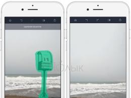
In order to enable the normal interface, select the "Administration" tab (the last lower item), then find the "Program Settings" item (in the upper right corner), see Fig.1.
In the window that opens, go to the "Interface" tab, select "Interface of previous versions of 1C: Accounting 8", and click the "Save and close" button, see Fig.2.

To change the interface, the program will ask you to restart the 1C:Enterprise session, see Figure 3.

Click "Yes"...
Congratulations, you have an old familiar interface!
Electronic supplies 1C - 100% license! Buy as quickly as possible!
How to enable the TAXI interface in 1C: Accounting 8?
In order to enable the new fashionable Taxi interface, select the "Administration" tab (in the upper right corner), then find the "Program settings" item, see Figure 4.

In the window that opens, go to the "Interface" tab, select "Taxi interface (recommended)", and click the "Save and close" button, see Fig.5.

To change the interface, the program will ask you to restart the 1C:Enterprise session, see Figure 6.

Click "Yes"...
Congratulations, you have a new fancy interface!
Stock! 1C: Accounting + 1C-Reporting for 3000 rubles.
What was it for?
As usual, the new interface is designed to improve the usability of the program.
Differences between the interface "Taxi" 1C: Accounting compared to the usual:
- larger font;
- optimization of the workspace on monitors with different resolutions;
- modern ergonomic interface design;
- buttons "Tools", "Favorites", "History" are collected in one panel;
- fast entry by line;
- the ability to add new elements of directories directly in the selection list;
and etc.
Keywords: taxi interface 1s, taxi 1s 8.3, taxi interface in 1s 8.3, 1s accounting taxi, taxi mode in 1s, 1s how to disable the taxi interface, taxi interface, how to disable the taxi interface, How to disable the TAXI interface in 1C Accounting 8, 1s accounting 8.3 taxi interface, 1s enterprise 8.3 taxi interface, 1s 8 taxi interface, taxi interface 1s, interface 8.3 taxi, setting up a taxi interface, taxi interface how to enable, accounting 3.0 taxi interface, new taxi interface, 1s accounting 8.3 taxi interface, 1s enterprise 8.3 taxi interface, 1s 8 taxi interface, how to turn off the taxi interface, how to remove the taxi interface, taxi interface option
Tags: taxi interface 1s, taxi 1s 8.3, taxi interface in 1s 8.3, 1s accounting taxi, taxi mode in 1s, 1s how to disable the taxi interface, taxi interface, how to disable the taxi interface, How to disable the TAXI interface in 1C Accounting 8, 1s accounting 8.3 dachshunds
Usually, when it comes to the Taxi interface, everything somehow comes down to two main questions: "why did you need to make a new interface at all" and "why was it made this way and not different."
Oddly enough, but these two issues are inextricably linked in this case. And the reason is that for the user, application solutions and the platform are one. Therefore, if we want to rotate this "whole" in some direction, it may happen that it will not be enough to make changes only to the configuration. You will also need to change the platform accordingly.
Just such a situation we have in this case. But what is the "global" we have in mind with our application solutions, what did it result in the appearance of a new interface for the platform?
The fact is that with the advent of the web interface, with the release of 1C: Enterprise "on the Internet" (including through 1cfresh), in general, with the development of the Internet, the audience of users began to expand.
Previously, application solutions were focused only on trained users who received prior training and knew subject area. Or they might not be very prepared, but "next to" them there was always support in the form of their own IT service.
Now the situation has begun to change towards those users who have experience working with the Internet, with mobile devices, with programs that do not have economic specifics. They are more accustomed to mastering "from the screen", more demanding in terms of usability and ease of perception. They are used to being one-on-one with the program. They are used to the fact that to start working with the program you do not need to finish training courses, no need to read volumes of documentation. You can just sit down and figure out for yourself "how it works", "what needs to be done here."
Also, at large enterprises, not only active computer users (accountants, sellers) are starting to work with programs, but also those who have not actively used it at work before, for example, foremen in production. And our task is to try to reduce the "entry threshold" as much as possible, to try to remove from the user's path what can interfere with him. For individual users and small companies, this will increase the attractiveness of the program, and for corporate implementations, it will also reduce costs and time spent on employee training.
At the same time, it is important not to "go too far" and not to forget about the active users of the system, for whom the efficiency of work, and not ease of development, plays a significant role.
Of course, in such a situation, a lot depends on the configuration. The configuration should be "friendly" to the unprepared user. But, as our studies have shown, a significant number of problems are also generated by the platform itself, its interface. And these problems cannot be solved with a "good" configuration.
What we managed to find out
We have conducted numerous usability tests and observations of how users work with our standard application solutions. As a result of the analysis, we were able to identify a large number of problems, some of which we tried to solve with the help of Taxi. The main problems we observed were as follows:
- It is difficult to find what you need: a command in a panel, an item in a menu, a line in a list. For example, the more items displayed in a panel or list, the more time users spent searching. Very often, the search did not lead to a result, although the necessary information was in the list. The user had to resort to other search methods, if they were possible;
- It is difficult to find data: an order entered yesterday or an invoice for a specific buyer. The search in the list does not work well. The story doesn't work well. Users do not use "Favorites";
- Difficult to select in the input field. Users make little use of search as they type. The need to work with the selection form requires increased attention and often leads to the fact that the user loses the context of work. Adding a new data item from a select form almost always results in a loss of work context;
- Difficulties in working with the selection form. Most users search with their eyes without resorting to search, which leads to the problem described in point 1. Many users have problems with hierarchical lists. Especially for beginners who are unfamiliar with the data hierarchy adopted in accounting;
- Small interface elements: hard to see, hard to hit with the mouse. For example, buttons in the command bar in the form of pictures without text, navigation buttons in the calendar;
- And much more.
As a result of the struggle with these problems, a new platform interface was "born" - Taxi. Thus, the Taxi is not only (and not so much) a new appearance. Taxi is:
- Improved app navigation options;
- User configurable workspace;
- Usability improvement individual elements interface;
- New design.
Application navigation
One of the goals of developing Taxi was to improve the navigation through the application. In doing so, we were guided by the following considerations:
- Data and commands should be as close to the user as possible;
- The user must be sure that he can always find his data.
To implement these considerations, we had to change approaches to navigation in a number of areas.
We have elevated the role stories, as a data retrieval tool:
- Instead of a history of changes, we implemented a history of discoveries;
- Increased the number of elements saved in the history;
- Reworked the history display dialog. Divided records by dates, implemented a convenient search;
- We made a history panel that can be placed in the main window and have access to recent records "at hand". The history panel can, for example, be used to switch between open forms.
We have elevated the role elected, as a tool for accessing frequent data and functions:
- Implemented the ability to add to favorites not only data, but also commands;
- We gave the user the opportunity to add items to favorites almost anywhere in the program in "one click": from the form, from the function menu, from the history dialog;
- Reworked the display of favorites dialog and implemented a new search in it;
- Implemented the ability to rename favorite items;
We proposed to use the mechanism more and more often full text search data:
- Implemented a standard search form. Now full-text search is available in all application solutions;
- We finalized the mechanism itself in order to increase speed and improve the relevance of the results;
- Implemented automatic operation of scheduled tasks in the file version of work without the mandatory launch of a separate service connection. Thanks to this, the relevance of the full-text index in the file version is now maintained as simply as in the client-server version.
In addition, we:
- Implemented a toolbar with which you can access all the main ways to navigate the application: function menu, favorites, history, data search;
- Changed the design of the function menu, increasing the visibility of perception a large number commands;
- Removed the link between the "Basic" section and start page. Now these are two separate unrelated entities.
- The role of the “logical group of commands” was assigned to the sections:
- section is not workplace;
- A section is a way to get access to a list of commands united by an applied meaning.
- Implemented quick access to the home page;
- Implemented alternative navigation through open forms in the Forward/Back paradigm.
User workspace
Observations of the work of users have shown that each "workplace" is unique. First of all, these are different sizes of monitors. Secondly, these are different tasks that the user performs.
Realizing that we won’t be able to make one solution that suits everyone, we decided to give the opportunity to “design” the workplace.
For example, a small monitor, a small screen resolution. In this case, the panels in the main window will take up valuable space from the workspace. Therefore, we give the opportunity to maximize the workspace by disabling all panels except the toolbar.

At the same time, all the possibilities of navigating the application remain available from the toolbar.
When using a mouse, some of them will become "further" due to extra "clicks", but this is a reasonable price to pay for increasing the working area.
Another example is the new widescreen monitor. Here we are not talking about saving usable space. In this case, you can organize the workplace for the most comfortable work: display both the sections panel, and the history and favorites panels. If the specifics of the work require frequent switching between open forms, you can use the open panel. For small configurations, use the command bar current section may be more convenient than the function menu.

Not only the user, but also the developer can manage the panels. Given the specifics applied solution, it can set the composition and arrangement of panels by default, for example, enable the command panel of the current section for small configurations.

And you can specify the configuration of panels for a specific user during implementation. This setting can also be configured by the user.
Input field usability
We have significantly improved the usability of the input field when selecting a value. There were several problems here.
First, the select button next to the input field. Seeing this button, most users click it without trying to start typing in the input field itself. And according to our observations, in most cases, selection by input is much more efficient than using a selection form. In this case, the user has less negative emotions.
Secondly, not all users understand which fields can be entered for selection.
And thirdly, the situation when a field has a select button and a select button from a drop-down list often confuses the user. Which button should be pressed?
After analyzing these problems, we decided to change the behavior of the input field. Now the main mechanism for selecting a value is the new dropdown list. This list combines several entities:
- Matched values;
- Selection history;
- Selectable list (from the corresponding property of the form element).
It is opened by a new button (drop-down list button), by activating the input field with the mouse and by selection.
Novice users, and often not only beginners, mainly use the mouse. By "pasting" the mouse on the input field, they will now see a drop-down list, which is designed to:
- Show that a value is being selected in this field, and not just entering text;
- At the first opening, explain that you can enter text for searching in the field;
- With the help of history to help in the selection, if such values have already been recently selected;
- Give the ability to add a new element without opening the selection form;
- And finally, open the selection form, if nothing else came in handy.
In professional work, using the keyboard, the drop-down list does not automatically open, so as not to interfere with the data entry process.
Previously, it was not possible to understand why the matched values are not displayed: nothing was found or there are too many of them. Now, during the selection process, the values are displayed immediately.
Previously, a message stating that there were no matched values for the entered text was displayed as a separate dialog. This dialog appeared when trying to leave the field. We decided that this was not the best solution, and now this message is displayed in the drop-down list during the input process.

The selection button "moved" to the drop-down list. We understand that opening the select form is now "longer": "click" in the input field to open the dropdown list and then "click" on the hyperlink in the list itself. But this is a conscious decision in order to “push” the user to use the search by set and open the selection form as rarely as possible. To "sweeten the pill" we did:
- History of the last selected values;
- The ability to search not only at the beginning of the line, but also by substring, as well as full-text search;
- Entering a new one without opening the list form.
This behavior is now standard. But if a specific situation requires otherwise, the select button can be returned to its original place.
You can use formatted strings to represent the pick and choose values in the drop-down list. This makes it possible to visually highlight certain lines or parts of lines using text color or font.
New design
The qualitative changes taking place in the audience of users required, among other things, changes in the design of the interface. Here we had many different considerations, both simple and understandable, lying on the surface, and more complex, having a deep, historical, one might say, character.
The most difficult consideration was related to the intensive development of the Internet in recent times. Previously, the main users of computers were professionals who used them for business tasks. Therefore, interfaces were familiar to them, the main task of which was to provide the ability to perform certain functions. At the same time, very little attention was usually paid to the aesthetic and usability side of the interface. If the interface allowed necessary set functions and did not cause obvious rejection, it was considered normal.
With the development of the Internet and mobile devices a large number of users have appeared who actively (and very actively) use the computer, but for completely different tasks: blogs, wikis, conferences, social networks, etc. At the same time, common features for all such applications are that, firstly, a large number of very different unprepared users work simultaneously with one application, and secondly, there are simultaneously a large number of competing resources. Many different conferences on the same topic, many social networks, similar in their capabilities, many search portals, etc. And the user is free to choose the resource that he likes best.
In such a situation, one of the main places was no longer functionality (it is approximately the same for everyone), but the aesthetic appeal of the resource. And then the convenience and usability of the interface. This led to the emergence, for example, of a whole trend in interface design, web 2.0, and then the further development of these ideas in the direction of simplicity, elegance, graphics and usability.
As a result, we now have a huge number of computer users who are accustomed to completely different interfaces and consider them "usual", convenient and understandable.
Our other consideration was not so deep, but it is inextricably linked with the first. With the fact that Internet users are used to the fact that they are not tied to any one resource, but can choose one of several similar resources that they like best. One or the other postal system, this or that search portal, this or that conference, etc. In other words, for many users, the program should already be not only useful, but also "pleasant".
As they say, "they are met by their clothes." And so that the user's communication with an unfamiliar program does not end there, it is necessary that this clothes be "smart".
The rest of our considerations were simpler, clearer and more obvious. For example, we were reproached for the fact that our interface is "small". It is difficult to "search with your eyes" in it, it is difficult to work with the mouse, it is difficult to "hit" some elements - you need to "aim", etc.
As a result, a design was born, the distinguishing features of which are large fonts and increased sizes of elements. Along with the increase in the font, the indents between the elements harmoniously increased, the interface began to "breathe".
There were changes in the color scheme, the same shape appeared in the forms. White background forms and fields, highlighting the active field, color highlighting group headers, the ability to highlight the entire group with a background color, and other improvements. The size of the form elements has changed, new elements have appeared, for example, "Toggle".
At the same time, we did not forget that working on devices with touch input is becoming more and more relevant. And all the solutions in the interface were tried on how it would work on a tablet, for example.
A little about plans
We always strive to make the transition to new version platforms. But, unfortunately, not everything can be done automatically, some points require manual intervention.
This happens with the Taxi interface. With simple forms, there are no problems when you turn on the Taxi interface. But complex forms designed in the "old" ideology and under the old interface will not automatically look good in the Taxi interface. First of all, due to the fact that fonts and indents have increased. And there are many more "small" monitors. Such forms will require refinement and alteration. Somewhere not very difficult, somewhere more significant.
We understand this problem, and we are taking certain steps to ensure that it does not become a stumbling block when moving to version 8.3. In the near future, we want to offer a solution that will allow developers to smoothly "transfer to Taxi", "stretching" the adaptation process. This solution will automatically allow you to use the old complex, "saturated" forms without processing.
In the Taxi interface, such a form will no longer look like the old one, but it will not look completely "taxi" either. However, it will be possible to work with it and all new interface features will be available for it.
Sooner or later, such forms still need to be reworked, but this can be done, firstly, gradually, and secondly, already when the entire application solution works on the new 8.3 platform.
There are other areas in which we are going to develop the Taxi interface. One of them is the improvement of the search in the list.
Customizing the Taxi interface
Setting up the Taxi interface in 1C: Accounting 8 edition 3.0
The materials of the article are relevant as of 20.08.2014.Reprinting of the article is allowed with the indication of the author and a link to the source.
Starting from version 3.0.33, the 1C: Accounting 8 program began to be delivered with two interfaces. New interface called "Taxi". It is his developers who recommend using it when working with the program right now, since in a few months the old interface will be removed from the program and only Taxi will remain.
But not all users liked Taxi at the beginning after switching from edition 2.0 and having received answers to the question: “What exactly do they not like?”, We can conclude that what they don’t like is basically simply not configured by the user.
This article discusses the main options for configuring the Taxi interface in 1C: Accounting 8 edition 3.0 in user mode.
When you start the standard configuration 1C: Accounting 8 edition 3.0, we open:
region system commands(at the top)
toolbar (top left)
sections panel (left)
home page (in which we see the Accountant's Task List, Manager's Monitor, a full-text search field and links to go to background information to various sites of the company 1C) (Fig. 1).
In the lower right corner, a window will periodically appear with a recommendation to configure backup, clicking on which you can go to the backup settings section. I draw your attention to the fact that the backup setting is individual for each user, i.e. having set up backup for one user, other users will still have this window until each of them enters the setting and unchecks the “Perform automatic backup” checkbox. If each user configures backup "At shutdown", then when exiting the program to create backup the work of other users will be blocked while the backup is being created, which may create some inconvenience for other users, so I recommend that one of the users set up the backup.
I will not dwell on the “System command area” setting, since it is the same as in the Interface in previous version 1C: Accounting 8.
Many users who have switched to the Taxi interface find it inconvenient, because the Section Panel is on the left, and not on top (as it used to be) and that the Taxi interface does not have the ability to display windows in Tabs so that you can return to a previously open form.
Both of these inconveniences are to some extent solved by adjusting the location of the panels.
To do this, let's turn to Menu - View - Panel Settings (Fig. 2).

Here you can customize by dragging the areas which panels you want to see and where to place them. For example, let's place the Partition Panel and the Toolbar at the top, and place the Open Panel at the bottom (Fig. 3). It is the Open Panel that will replace the familiar Bookmarks.

As a result, we will get a more familiar and, in my opinion, more convenient view of the program (Fig. 4).

Depending on the size of your monitor, you can position the Function Bar of the current section either on the left (Figure 5) or on the top below the Partition Bar.

Or you can not display it at all, since the Taxi interface provides another option for accessing the Function Panel commands (in my opinion, more convenient) - this is a click on the Function Panel element, since in this case we will see all available commands.
If at the location of the Panel of open windows below we open many windows, then the inscriptions in the tabs become unreadable (Fig. 6).
Therefore, with widescreen monitors, it may seem more convenient for someone to place these tabs on the right (Fig. 7).

You can also add the visibility of the Favorites Panel and the History Panel, but in order not to load the monitor to the detriment of the workspace, I do not do this, and if necessary, you can use the buttons on the Toolbar to access these services (Fig. 8).

You cannot go to the Partition Panel settings with the right mouse button, as it was in the previous interface. It is configured through the Menu - View - Settings section panel (Fig. 10).

You can remove the sections you don't need, change the order of their display, and also select the display option (text, picture or picture and text) (Fig.11).

To change the composition of the Functions Bar of the current section, click in the corresponding section of the Sections Bar and select Navigation Settings, where you can add or remove the visibility of certain commands, as well as change the order in which these commands are displayed. Moving a command to the Important submenu means that this command will be displayed at the top of the list and highlighted in bold.
On the initial stage getting used to the new interface, as well as after each update, I recommend adding all commands to the selected commands field. So you will quickly find rarely used commands so that you do not get the impression that some commands are missing (Fig. 12).

To restore the default settings of the commands that, according to the developers, are used most often, you can use the More - Install button standard settings(Fig.13).

But even with the visibility of all available commands in all sections, you may encounter a situation where you cannot find the command you need.
And then the All functions team will help you. Unfortunately, this command is not visible by default. In order for it to appear, you need to go to Menu - Tools - Options - check the box "Display the All Functions command" and then it will appear in the menu.
By calling All functions you will have a tree of all program objects from which you can find and open any directory, document, report or processing (Fig. 14).

If you have a gray bar at the very bottom on which red inscriptions periodically appear with some current and accumulated calls and they interfere with you, then this performance panel can also be removed through Menu - Tools - Options - Display performance panel.
The Favorites Panel has been developed in the Taxi interface.
You can add any section, list, database object, report or processing, and even a command to this panel.
For example, we often look at:
Bank statements,
documents for the sale of goods and services,
OSV and OSV reports on the account
deleting marked objects.
Let's add these elements to Favorites and in the future, to open the Bank Statement or OSV journal, just open the Favorites panel and click given command(Fig.15).

To add an element to the Favorites Panel, click on the star that appears to the left of the element when you hover over it with the mouse.
Items in the Favorites list can be moved by simple drag and drop, we can rename them, and we can mark the most significant items for us as “important” and they are highlighted and displayed at the top of the list.
Also, even a specific document can be marked in the favorites panel (for example, so as not to look for it tomorrow, if you still need to work with it) or, for example, if we often watch dollar rates, we can quickly access the dollar element from the Currencies directory.
With a widescreen monitor, the Favorites panel can be fixed on the screen and then the most frequently used commands will always be in sight (Fig. 16).

There is also the History panel, which stores information about the last opened documents and directories, indicating the date and time when these documents were opened, through which you can also go to previously opened documents and directories (Fig. 17).

In total, no more than 200 lines are stored in the history. The History panel can also be docked to the screen area.
Well, the last thing we will configure from the appearance of our interface is the setting of the Home page.
It is configured through the Menu - View - Initial page settings (Fig. 18).

For example, you can remove the desktop and Information Center and place, for example, a Journal of Operations or a Journal of Bank Statements. Or if the manager is engaged, for example, only in issuing documents to buyers, then you can place a magazine of buyers' documents on the home page.
Often, users who have switched to the Taxi interface complain that the document forms do not have convenient buttons with texts, there are no buttons, such as copy, change, mark for deletion, and so on.
Of course, all these commands are available and you can see them by clicking on the More button. Some commands are also available from the context menu called right click mice.
But in Taxi, you can customize which buttons, in what order and in what form you want to see them on the form screen.
To do this, click on the More button and select Change form (Fig. 19).

Here you can specify which buttons should always be visible (to do this, select the command of this button and set No in the "Only in More" element property. The buttons will appear in the command bar.
Also, if you are already accustomed to icons earlier, then in order to fit more buttons, you can set the display of the “Picture” buttons. (although not all buttons have pictures).
After that, you can arrange the buttons in the order that suits you best, using the arrows or simply dragging them with the mouse.
As a result, you can get, for example, the following type of document Sales of goods and services:

I draw your attention to the fact that documents with tabular sections have 2 More buttons. One common for commands related to the entire document and the second for commands related to the tabular part of the document.
The form setting, including the tabular part, is located in the More button, which refers to the commands of the entire document as a whole.
Similarly, you can customize the view of the document log by changing the output columns of the list.
If you want, you can even change the format of the date representation if you don't like that the time is shown after the date (but I don't recommend doing this).
Well, if you are already an experienced user, then you can disable informational links - tips at the bottom of the forms to save space.
Well, if during the setup process you did something and now you don’t know how to fix it, you can always return to the standard settings.
The return is in the More button next to the Form Settings (Fig.21).

In addition to command buttons, forms can have their own navigation bars, which you can also customize as you like (Fig. 22).

This can be done through the View menu - Customize the form navigation bar (Fig.23).

With the development of the platform and configuration, there will be new customization options user interface without the participation of programmers. I will try to keep you informed of the most interesting changes.
Wish you success,
Sergey Golubev
What is a taxi interface in 1s
Touching upon the topic regarding the Taxi interface, I would like to consider two main questions that are most often not clear to users: “why is a new interface needed at all and why did it need to be made just like that?”.
Answering this question, we want to immediately note that, as a rule, users do not distinguish the difference between an application solution and a platform. For them, it is one. Actually this is not true. If we decide to make changes to this “whole”, then as a rule, changes should be made not only in the configuration, but also in the platform.
This is exactly the situation with the Taxi interface. What was so global that the developers conceived, which ultimately required its improvement?
The main reason lies in the fact that since the advent of the web interface and the release of "1C: Enterprise" to the Internet (including access through 1cfresh), and indeed with the development of the Internet itself, the user audience began to expand rapidly.
The first applied solutions were aimed only at those users who were specially trained and prepared to work with them. They received preliminary training and mastered the subject area. Of course, not everyone had high level training, but then they could only turn to their own IT service.
Nowadays, the situation has changed significantly towards users who have skills in working with the Internet, as well as with mobile devices and programs that do not have economic specifics. Modern users are more accustomed to learning new things "from the screen", while ease of perception and convenience of usability are important for them. Now, before starting to work with the program, almost no one finishes courses or reads books and documentation. The development of programs takes place directly in the process of working with it, during which they understand how it works and what needs to be done in it.
In addition, even in large companies with specialized software solutions, not only those who are active computer users begin to work, but also those who have not needed to work with it before, for example, a foreman who previously worked in production. Thus, the task of developers is to ensure that the “entry threshold” is as low as possible for users, and nothing prevents them from quickly understanding the principle of the application. Moreover, such easy-to-learn software solutions are more attractive for small companies, as well as for mass installations, since they do not require time and money to train employees. However, do not forget about active users, for whom efficiency is more important than ease of use.
In such conditions, a lot depends on the configuration. It should be convenient for the untrained user and still provide performance. Based on practice, problems during operation can also be created by the platform itself and the interface and cannot be solved simply by a “good” configuration.
What is taken into account in the new interface?
In the course of numerous tests and observations of the work of users with typical application solutions, specialists were able to identify the main problems that they tried to resolve in the new Taxi interface. What were these problems? Below we provide a list of those situations that caused difficulties for users while working with programs:
- It is difficult to find the necessary object: an item in the menu, a command in the panel, a line in the list. The more tools displayed in the list or panel, the more time the user needed to search. In some cases, the desired objects could not be found, although they were present. Thus, the user should use other search methods if they were available.
- It is difficult to find the necessary data: the invoice of a specific buyer and the order entered a day ago. Search in the system works unsatisfactorily, the history does not work well. Users access the "Favorites" extremely rarely.
- Difficulty choosing in the input field. Search is rarely used by users when entering, and when working with a form, increased attention is required and a situation often arises when the user loses the context of work. When adding a new data element from a form, the work context is almost always lost.
- Problems with the selection form. Most often, the user finds what he needs with his eyes, and not through the search bar, which causes the problem described in paragraph 1. Many people have difficulty with hierarchical lists, especially for beginners who are not yet familiar with the accepted hierarchy of data in accounting.
- Interface elements are very small. Sometimes they are hard to recognize or hit with the mouse. As a rule, these are buttons without text in the form of pictures, as well as navigation buttons in the calendar.
As a solution, which took into account all the problems described above, a new Taxi interface was developed, the distinctive feature of which is not so much its improved appearance, but:
- Improved in-app navigation
- Ability to customize the user's workspace
- Improved use of individual interface elements
Application navigation
So, one of the main goals during the development of "Taxi" was to improve the navigation through the application. In doing so, the task is to:
- Commands and command data were located as close as possible to the user
- The user had the opportunity to easily and always find the necessary data
In order to implement these tasks, it was necessary to change the approach to navigation in a number of directions at once. What happened in the end?
Managed to raise the role "stories" as a data retrieval tool. To do this, instead of the history of changes, a history of discoveries has appeared, the number of saved elements in the history has also increased, and the dialog for displaying it has been redesigned - entries are separated by date, and the search has become more convenient:
A dynamic history panel has also been included - it can be placed in the main window and, thus, access to recent records is always "at hand". You can also use the history panel to switch between open forms.

The role of the "Favorites" has also been increased - now it serves as a tool for accessing the main functions and data:
Now it is possible to add to favorites not only data, but also commands
Adding items to favorites the user can perform from the function menu, from the form, from the history dialog - in one click

The Select Favorites dialog has also been redesigned to include a new search
Implemented the ability to change the names of the favorites elements

Favorites panel created. Now all elements can be "fixed", and the favorites bar can be used as a panel for basic commands

There are new opportunities for more frequent use of the mechanism of full-text data search. Created for this standard form for full text search in all application solutions

The mechanism itself has been improved for faster and more successful results

Implemented automatic operation routine tasks in file mode work without the need to start a separate service connection. Thus, keeping a full-text index up-to-date in file mode is just as easy as in client-server mode.
In addition: A toolbar has been developed to enable access to the main methods of navigating the program: favorites, search in data, function menu, history

The function menu has also received a new design, which has improved the perception of a large number of commands.

The connection between the home page and the "basic" section is now missing. In the new interface, they are two separate and unrelated objects
Sections are assigned the role of a "logical group of commands". As a result, the section ceased to serve as a workplace, but became a way of gaining access to a menu of commands that are united by applied meaning
Developed faster access to start page

There was an alternative navigation in the Forward/Back paradigm on open forms

User workspace
During the observation of the work of users, it was revealed that each of them performs various tasks and each requires a specific monitor size. Since it is unrealistic to create such a solution that could meet the needs of all users at once, the developers decided that this situation could be changed for the better due to the possibility of “designing” the workplace.
For example, we have a small monitor and a small screen resolution. In such a situation, the panels in the window will take up quite a lot of space from the entire workspace. In connection with this, it was decided to increase the working area by disabling all panels, except for the toolbar.

Navigation options remain available in the toolbar. Some of the elements will become "further" due to extra clicks when working with the mouse, but this is nothing compared to what options are now available to the user for the convenience of his work.
Or let's take another example. We have a widescreen monitor. Here, of course, we do not need to save space. In this case, it is possible to organize the workspace in the way that was most comfortable for the user: you can display all panels at once - sections, history and favorites. If your work requires frequent switching between open forms, then for convenience you can use the open panel. In small configurations, using the current section's command bar may be more convenient than using the function menu.

Panels can be controlled not only by the user, but also by the developer himself. Based on the specifics of the applied solution, it can be set the location and composition of the panels by default. For example, enabling the command bar of the current section is available for small configurations.

During installation, you can specify the configuration of the panels for a specific user. The same settings can be set by the user himself.
Using the input field
Significantly improved the usability of the input field when selecting values. Previously, there were problems such as:
- Irrational location of the select button next to the input field. Many users, seeing this button, pressed it without starting the input in the field itself. As practice has shown, the most effective is the choice through the input than using the selection form
- It was not clear to all users which fields can be entered for selection
- The location of the field at once two buttons - a selection button and a button for selecting from a drop-down list. This often confused the user, as it was not clear which button should be used.
In connection with the listed "inconveniences", the developers changed the behavior of the input field. Now selecting a value is done via a dropdown list that combines the selection history, matched values, and selection list (according to the form element property).
A new button is provided to open the drop-down list, it also appears when the mouse is placed in the input field and when selecting.
The dropdown list lets the user know that the field is for selecting values and not just for entering text. In addition, already at the first opening it becomes clear that you can also enter text for searching in the field. For convenience, the values that were selected recently are stored in the history. If necessary, you can add a new element without opening the selection form. You can also use only the selection form if nothing else is useful. Additionally, we note that the drop-down list is not opened using the keyboard, in order not to interfere with data entry.
Previously, there were also problems with displaying matched values - either the search did not return any results, or it returned too many values. Now, during the selection, the values are displayed immediately. It is also worth adding that the messages about the result of the selected values, which were previously displayed as a separate dialog or when trying to leave the field, are now displayed in a drop-down list as you type.
The select button is now in the dropdown list. Of course, this usability lengthened the process of opening the select form, since a "click" is required in the field to open the drop-down list, and to click the hyperlink in the list itself. But this decision was implemented with the aim that the user can use the search in the set and at the same time use the selection form less often.
- The last selected values are saved in the history
- You can search not only at the beginning of a string or substring, but also by the input method full text
- You can enter a new value without opening the list form
Note that if necessary, the selection button can be returned to its previous location. The drop-down list also provides the ability to use formatted strings as representations of pickup values and a picklist. This allows you to visually highlight lines using text color or font.
New design
After the qualitative changes that have occurred in the user audience, demand changes in the design of the interface. On this score, the developers had a lot of different considerations, ranging from simple to more complex concepts. The main difficulty in creating an interface is associated with the rapid development of the Internet. As we have said before, users computer technology there were only specialists who needed it to perform business tasks, in connection with which the interfaces were familiar to them - their task was to provide the ability to perform certain functions. The aesthetic side and ease of use at that time were not the main aspects. The main thing is that the interface supports the necessary set of functionality, does not cause obvious rejection - it just be "normal".

The active development of the Internet and mobile devices has affected the user audience and now most of it is active users, which Computer techologies are required to perform completely different tasks - blogs, conferences, social networks, etc. Similar Applications combine several common factors - the ability to work in one program for a large number of users, regardless of their level of training, and competitive resources, that is, users today have a wide choice of social networks and search portals, etc. Among them, the choice is made in favor of those resources that suit the user not only functionality, but also in terms of usability and even external design.
So for modern applications it's not so much the functionality (it's about the same for everyone) that's important, but the aesthetic appeal, and then the ease of use of the interface. This trend has led to the emergence of a whole trend in interface design and to the further development of these ideas from the side of elegance, graphic, simplicity and usability. The result was the emergence of computer devices that are accessible to users and adapted to new interfaces that are considered convenient and understandable.
Another difficulty in developing the interface was due to the fact that it is not typical for Internet users to use only one resource, they can use several similar ones that they like the most - browser, mail, again social networks, etc. In other words, in this situation it is important so that the program is not only useful, but also “pleasant”. Now, the saying “meet by clothes” has become more relevant than ever for software solutions. Whatever the user's acquaintance with the program ends up with, it is important that it attracts with its appearance.
The remaining considerations of the developers of the Taxi interface were aimed at eliminating minor "shortcomings" - the difficulty of "search with your eyes" for the necessary elements of the application, the inconvenience of working with the mouse, the difficulty in "hitting" some elements, etc. As a result, we managed to create a design that has new distinctive features appeared, namely, increased sizes of elements and a larger font. The padding between elements has also been increased, which allowed the interface to become more “free”. The color scheme has also changed - now the form and fields have one white background, the active field has a backlight, group headers are highlighted in color, you can also highlight the entire group with a background color, etc. The dimensions of the form elements have also been changed, while new elements have been added, such as the Toggle Switch.
Separately, we want to note that when creating a new interface, we took into account the fact that work with the application can be performed on a device with touch screen which is very relevant today. Therefore, all solutions in the interface were also considered taking into account how it will work and be displayed on touch devices - tablets, etc.
What's left?
At the moment, developers are striving to make the transition to the new version of the platform as simple as possible. Now not everything can be done automatically, something else needs to be corrected “manually”. Simple forms will not cause any problems with the inclusion of "taxi", but as for those forms that were created for the old interfaces, they are not very well displayed yet. This is because padding and fonts have been increased, and users may also have a "small" monitor. These forms, of course, require improvement - somewhere this can be done without any problems, somewhere more significant changes will be needed.
Now the developers are trying to eradicate this problem, so that it does not become a "stumbling block" when moving to the new version 8.3. A solution is already on the way, which will allow a smooth transition to Taxi, without tangible problems in the process of adapting the program. This solution will allow you to work with old complex forms without processing. Of course, in the new interface, such a form will no longer look like the old one, but at the same time it will not become completely improved either, but it will be possible to work with it and all interface features will be available for it.
Publishing the fourth chapter of my book
Chapter 4 Appearance"Taxi"
In the final chapter of the first part of this book, we will analyze the features of user work with the appearance of a managed application - Taxi. We will get acquainted with the type of "Taxi" in more detail and in depth, because. this is the main type of work of the 1C client application at the moment.
Figure 1.4.1 shows the appearance of the Taxi interface using the example of my configuration, which we will do from the next part.
Rice. 1.4.1. Appearance of "Taxi"
Our first acquaintance with the Taxi interface will begin with the panels. If in the views there were only three panels (sections, actions and navigation), then in the Taxi there were six panels (see Fig. 1.4.2).
Let's briefly analyze each panel from Figure 1.4.2 (below, we will study in detail all the panels separately):
1 - Partition panel - displays command interface upper level subsystems.
2 - Function bar of the current section - includes commands that correspond to the current section.
3 - Toolbar - serves to quick access to a number of custom functions.
4 - Favorites bar - displays favorite navigation links.
5 - Open panel - displays the forms that are open in the current client session.
6 - History panel - a list of navigation links to previously opened objects.
7 - Workspace.

Rice. 1.4.2. Taxi Appearance Panels
We figured out the total number and purpose of the panels, now we will learn how to configure the location of the panels at the development stage. To do this, go to the configuration properties (see Fig. 1.4.3).

Rice. 1.4.3. Path to configuration properties
In the palette that opens, we are interested in the "Client Application Interface" property (see Fig. 1.4.4).

Rice. 1.4.4. Client Application Interface property

Rice. 1.4.5. Client application interface configuration window
The client application settings form is divided into two parts. On the left - groups of panels location relative to the workspace. On the right are the panels themselves. In the window on the right, opposite some panels, a gray square is displayed, this is a mark that this panel already in the interface. By moving panels from the left window to the right window with the mouse, the configuration developer can independently customize the interface of the client application with one limitation: the same panel cannot be selected twice. Otherwise, there are no restrictions. It is possible, for example, to place all panels on one side, as in figure 1.4.5. True, the client application will most likely not be very convenient.

Rice. 1.4.6. Not the smartest example of setting up a client application
The panel customization specified in the "Client Application Interface" configuration property will be displayed to the user in the event that he did not set up the application interface on his own. Let's learn how to customize the layout of panels in 1C:Enterprise. To do this, the user needs to go to the panel editor through the main menu (see Figure 1.4.7).

Rice. 1.4.7. Path to panel editor

Rice. 1.4.8. Panel Editor
The panel editor (see Fig. 1.4.8) is divided into two parts. Top part shows a schematic layout of panels in the client application relative to the workspace. At the bottom (highlighted in gray) are panels that are not included in the interface. Using the mouse, the user can independently position any panel relative to the workspace, moving them from the bottom to the top. It is also possible to move panels relative to each other along the top of the panel editor. After the user has configured desired view, you must click the "Apply" button in order for everything to be displayed in the client application. In the event that the user wants to return to the view provided by the configuration developer, he just needs to click the "Standard" button.
home page

Rice. 1.4.24. Setting up navigation in the Taxi interface
There's also an "Important" group, things in bold, a "General" group, and a "See" group. also". If the section has a subsection, as in our case, then it is also allocated to a separate group, where there are subgroups "Important" and "Normal". The user can independently move commands from one group to another, delete, add and perform other manipulations. To set the standard settings specified by the configuration developer, you must click the "More" button and select the "Set default settings" item in the drop-down menu (see Fig. 1.4.25). 
Rice. 1.4.25. Setting default navigation settings
Let's set the standard settings for our navigation and see how the menu of functions and the function panel of the section will change (see fig. 1.4.26 - 1.4.28). Compare them with what happened before, in figures 1.4.20 and 1.4.21.

Rice. 1.4.26. Setting default navigation settings

Rice. 1.4.27. Function menu at standard settings

Rice. 1.4.28. Function panel of the current section with standard settings
With action settings, everything is also simple (see Fig. 1.4.29). They are similar to the action bar settings from the previous chapter. Similarly, there are three groups: Create, Reports, and Service. In the "Create" group there are commands for creating new directories or documents, in the "Reports" group - commands for opening reports, in the "Service" group - commands for starting processing.

Rice. 1.4.29. Action Tincture
By analogy with the navigation settings, you can set the default settings set by the developer using the "More" - "Set default settings" menu.
Let's get acquainted with one interesting feature that appeared in the Taxi interface - a menu search. It often happens in practice that there are many commands in the function menu, and it can be problematic to quickly find the right command. To do this, the platform developers have implemented a menu search. The function menu search input field is located in the upper right corner of the menu (see Fig. 1.4.30).

Rice. 1.4.30. Search field in function menu
It is enough to start typing when the function menu is open and the search will be carried out automatically (see Fig. 1.4.31).

Rice. 1.4.31. Function menu search
The search is case-insensitive.
And finally, we learn about two more ways to open the function menu. The first way is by using the toolbar, where there is a special icon corresponding to the function menu (see Fig. 1.4.32). The second way is by using the F10 key.

Rice. 1.4.32. Icon in the toolbar to open the function menu
Panel open
Above we mentioned that the user between open windows can navigate using the navigation arrows as well as using the open bar. Let's analyze it in more detail. Let me remind you that you can independently place this panel in any part of the 1C:Enterprise interface using the panel editor (see Figure 1.4.8).

Rice. 1.4.33. Panel open in the interface "Taxi"
The open panel contains a list of all forms that have been opened by the user during the 1C:Enterprise session. This list is sorted by the time the form was opened, as a result, each newly opened form is placed at the end of the list. When the user activates the desired list item, the form corresponding to this item is displayed in the workspace, and the selected item is highlighted in green (see Fig. 1.4.33).
In order to close an element, it is necessary to click on the cross located in the upper right corner of the element display in the list. Moreover, you can close both the active element, the form of which is active in the workspace, and any other element from the list. When the active element is closed, the form at the very end of the list becomes the current one.
We continue to study the arrangement of forms in the workspace. In the Taxi interface, it is possible to attach desired shape to any side of the workspace, for this you need either to call the context menu of the element in the open panel (see Fig. 1.4.34), or in the system commands area, click on the button "Show together with another window or pin" (see Fig. 1.4 .35).

Rice. 1.4.34. Context menu panel element open

Rice. 1.4.35. Menu of the "Show with another window or dock" button of the system command area
Now let's fix the sales report form from Figure 1.4.33 on the right. The appearance of the 1C:Enterprise interface will change (see Figure 1.4.36).

Rice. 1.4.36. Appearance of 1C:Enterprise with the sales report form attached to the right
Moreover, only one form can be attached and in one part of the workspace. In the 1C 8.3.9 platform, it is not possible to attach different forms from different sides. If you want to pin another form, the current form will be unpinned.
The same rule will remain in platform editions 8.3.10 and 8.3.11, only the window pinning mechanism will be improved.
In addition to the docking mechanism, there is a form merging mechanism: You can make two forms appear together on the workspace, grouped either horizontally or vertically.
To do this, in the context menu of the form (Fig. 1.4.34 and 1.4.35) select either the item "Show together with others vertically" or the item "Show together with others horizontally". These items have a continuation (see Fig. 1.4.37), where you need to choose which form you want to show along with the current one.

Rice. 1.4.37. Choosing a shape to merge
In the context of our example, we will merge horizontally the "Incoming Goods" form into the "Outgoing Goods" form. In Figure 1.4.38 you can see what appearance 1C:Enterprise will acquire after these actions.

Rice. 1.4.38. Horizontally merged list shapes
In the 1C platform 8.3.9 (and this rule, most likely, will also be in platforms 8.3.10 and 8.3.11), you cannot attach combined forms. If you try to pin one of the merged forms, their merging will be reset.
Navigation links
Starting from platform 8.1. navigation links appeared in 1C:Enterprise. A navigation link is a text representation of any object (catalogue item, document, list form, etc.) that can be used to open this object in 1C:Enterprise. Let's take them into practice. You can work with navigation links through the area of system commands (see Fig. 1.4.39).
Rice. 1.4.39. System command area


Let's open some document in my training configuration and execute the "Get link..." command (see Fig. 1.4.42).

After executing the command, a form for obtaining a link will open, where the form field will contain a link to the desired object. Here is the text: "e1cib/data/Document.Incoming Goods?ref=8a6f00235402431011e6e3299dc1822e" and is a link to the document "Arrival of goods No. 000000001 dated 01/25/2017". After we copy the link to this document to the clipboard, we can open it from anywhere in this database. Moreover, you can send it by mail or some messenger to a colleague who works over the network with this database, and he will easily open this link (if he has the rights to at least view this object). Opening a link is just as easy: to do this, use the "Go to the link ..." command in the system commands area (see Fig. 1.4.43) or in the main menu. And especially fast ones can work with a combination Shift keys+ F11.
After executing this command, the "Following the link" form will open. In the only field of this form, you need to copy the saved link and click the "Go" button (see Fig. 1.4.43).

After these steps, a document will appear in the workspace, the link of which we clicked on.
Favorites bar
As you can see from Figures 1.4.42 and 1.4.44, the "Get Link" and "Follow Link" forms have an "Add to Favorites" button. Favorites are some kind of object, and any object: processing, report, directory element, document, list form, etc., with which the user can work very often. You can add to favorites in several ways.
The first way is with the help of the “Get a link…” and “Following a link…” commands already known to us, in the windows of these commands there is an “Add to favorites” button (see Fig. 1.4.42 and 1.4.44). By clicking on this button, you will add to your favorites the object, the link to which is indicated in the input field.
The second way is that you can click on the "Star" icon next to the title of any object located in the workspace. Somehow: a document (see Figure 1.4.45), a list of documents (see Figure 1.4.46), or a report (see Figure 1.4.47). 
Rice. 1.4.45. Add to favorites icon for a document

Rice. 1.4.46. Icon for adding to favorites in the list of documents

Rice. 1.4.47. Icon for adding to favorites near the report form

Rice. 1.4.48. Positioning the Favorites Bar in the Panel Editor

Rice. 1.4.49. Favorites panel in 1C:Enterprise
Working with the favorites panel is quite simple: you need to click on the desired link with the mouse, and it will be displayed in the workspace. If you need to edit the list of favorites, you can do this by calling the favorites form. This form can be called in three ways.
The first way is to click on the word "Favorites" in the Favorites panel itself (see Fig. 1.4.50). The second way is to use the toolbar, where you need to click on the Star icon (see Fig. 1.4.51). And the third - using the keyboard shortcut Ctrl + Shift + B.

Rice. 1.4.50. Go to favorites settings, through the favorites panel

Rice. 1.4.51 Access to favorites settings via the toolbar
After the above actions, the favorites form will open (see Fig. 1.4.52), where the user can perform a number of actions.

Rice. 1.4.52. Favorite form.
Let's analyze all the user's options for working with the favorites form.
And we'll start with a search. As well as in the Taxi interface in general, the user can search for favorites, this is done in the field in the upper right corner of the form. In order for the search to start working, it is enough just to type the text when the window is open, or use the keyboard shortcut Ctrl + F. After the search is completed, those objects whose names contain the desired combination of characters will remain in the favorites (see Fig. 1.4.53). The search is case-insensitive.

Rice. 1.4.53. Search in favorites form
You can cancel the search by pressing the Esc key.
Also in the form of favorites you have the ability to manipulate the list of objects. For example, you can edit the name of an object by hovering over the object and clicking on the "Pencil" icon (see Fig. 1.4.54).

Rice. 1.4.54. Editing an object in the favorites form
In this case, you will only edit the representation of the object in the favorites form. Nothing will happen to the representation of the object in other windows.
In addition to editing, you can safely delete an object. To do this, just select the desired object and click on the cross next to the selected object (see Fig. 1.4.55).

Rice. 1.4.55. Deleting an item in the favorites form
And you can also move objects around the list. You can do this either with the mouse (drag the object up or down), or with the help of the context menu (see Fig. 1.4.56), using which, by the way, you can edit and delete the desired objects.

Rice. 1.4.56. Context menu in favorites form
I would like to note one more feature when working with the form and the favorites panel: when you add a new object to favorites (as in Fig. 1.4.45 - 1.4.47), all other objects are moved down. But in the favorites form, it is possible to pin the desired object so that it always remains at the top of the list. To do this, select the object and click on the Paperclip icon (see Fig. 1.4.57).

Rice. 1.4.57. Pinning an object in the favorites form
After applying these actions, you will see that the object is highlighted in bold text, and it will automatically move to the top of the favorites panel after the form is closed (Fig. 1.4.58).

Fig.1.4.58. Favorites bar with item selected
And before I finish studying the favorites panel, I will note some of its features. As you may have guessed, you cannot delete, edit, move and attach objects in the favorites panel itself (only through the favorites form). In addition, when the favorites bar is opened vertically, only the first 10 items are displayed, when the favorites bar is opened, only those items that fit are displayed. At the time of this writing, there are no scrollbars on the favorites bar.
Story panels
Those who worked in 1C as a user know that very often there is a need to open some document or report that they have worked with before. Previously when running on 8.0 platforms. and 8.1. I had to either remember or search in all sorts of tricky ways.
But already from platform 8.2. it became possible to work with the history of the use of objects. And already in the Taxi interface of platform 8.3. this mechanism has acquired a more convenient and user-friendly look. Now the user can view all the objects with which he previously dealt.
For example, the user launched the 1C program and, using the section panel and the function menu, opened the list form of the document "Arrival of goods", it is immediately recorded in the history that the user worked with the corresponding object. Then he opened a document, and this is also recorded in history. And that's it. Whatever he does with the document: he posted it, changed the details, marked it for deletion - the history only shows that he was working with a specific document. From the history, we cannot find out what actions were performed with this document. There are other mechanisms for this. The history is needed only so that the user can quickly go to the desired object (by clicking on it with the mouse), and not look for it in the program interface. Moreover, if the user opened the same object several times a day (for example, ran a report), then the history will contain only one entry about the use of this object and with the latest time. Note that the history is stored in information base, i.e. when clearing the cache or when moving the database from one device to another, the history is saved.
You can work with the history of using objects using two forms: the history form (Fig. 1.4.59) and the history panel (1.4.60).

Rice. 1.4.59. The shape of the stories

Rice. 1.4.60. Stories Panel
Moreover, in the form of stories you can see all used objects grouped by days (maximum can be 400 records for each user). And in the panel of stories, or the first 10 with a vertical arrangement of the panel, or as many as you like with a horizontal one. The question of how to place the story panel in 1C:Enterprise will not cause much difficulty for you: once again we will use the panel editor. But there are several ways to get into the form of stories. The first way is to click on the "History" heading or the corresponding icon on the right in the history panel (see Fig. 1.4.61).

Rice. 1.4.61. Switching to the stories form via panels
The second way is using the toolbar already familiar to us, where you need to click on the corresponding icon (see Fig. 1.4.62).

Fig.1.4.62. Switching to the history form via the toolbar
And with the keyboard shortcut Ctrl + Shift + H.
Let's take the form of stories. As can be seen from Figure 1.4.59, the history of all objects is grouped by day and sorted by time in descending order. To the left of the list of objects, sometimes there are icons "Star", which means that the object has been added to favorites. You yourself can add an object to your favorites from the history form or remove it from there by putting or deleting a star.
In the same way as in the form of favorites, in the form of history you can use the search. It is enough to start writing a word or use the key combination Ctrl+F (see Fig. 1.4.63).

Rice. 1.4.63. Search in the stories panel
The principle of searching in the stories panel is exactly the same as in the favorites panel, so we will not focus on it.
Toolbar
The toolbar is required for quick access to four 1C:Enterprise functions.
- Function menu (Fig. 1.4.64)
- Favorite form (Fig. 1.4.65)
- History form (Fig. 1.4.66)
- Full-text search form (Fig. 1.4.67).

Rice. 1.4.64. Accessing the function menu

Rice. 1.4.65. Access to the favorites form

Rice. 1.4.66. Accessing the history form

Rice. 1.4.67. Accessing the full text search form
You are already familiar with the favorites and history forms, as well as with the menu of section functions, so we will not focus on them, but will deal with the full-text search form (see Fig. 1.4.68). In addition to the toolbar, it can also be called using the key combination Ctrl + Shift + F.

Rice. 1.4.68. Full text search form
The full-text search engine allows you to quickly find necessary information in the 1C:Enterprise database and reference information.
Custom reshaping
IN managed application the user can independently change forms: add, delete, move form elements, and also change the composition of form tables. Consider the basic principles of changing forms on the example of the document "Sale of goods". Figure 1.4.69 shows the default form of this document.

Rice. 1.4.69. Appearance of the document "Sale of goods"
To edit a form, go to the "More" form group and click the "Edit form" button (see 1.4.70).

Rice. 1.4.70. The Reshape command of the More group
The developer can forbid changing the form, then this button will not be in the "More" group. We will learn how to disable form edits in Part 3 of this course.
After executing the "Change form" command, the form settings window will open (see Fig. 1.4.71).

Rice. 1.4.71. Form settings window
In this window, you can remove visibility from the fields, move them relative to each other, add subordinate fields, and also create your own groups for a more convenient arrangement of fields.
Let's consider all these possibilities of editing the form in more detail.
In order to remove visibility from the desired element, it is enough to uncheck the flag next to this element. For example, let's remove the visibility of the "Type of sale" field (see Fig. 1.4.72) and see how the form changes (see Fig. 1.4.73).

Rice. 1.4.72. Removed visibility in the "Type of sale" element

Rice. 1.4.73. The "Type of sale" element is not displayed on the form
Elements can be moved relative to each other. Using the arrows "Move up", "Move down" and with the mouse (you need to "drag" the element to the desired position). Let's move the "Contractor" and "Warehouse" elements below the invoice number and invoice date (see Fig. 1.4.74 and 1.4.75).

Rice. 1.4.74. Shifted the fields "Warehouse" and "Contractor"

Rice. 1.4.75. Form with the "Warehouse" and "Contractor" fields shifted down
It is very convenient sometimes to group elements, for example, let's make the "Number" and "Date" fields horizontal.
To do this, you need to add a new group by clicking on the "Add group" button of the form settings, in the group properties you can remove the flag from the "Display title" property and set the "Grouping" property to the value "Horizontal" (see Fig. 1.4.76).

Rice. 1.4.76. Adding a new group and setting group properties
After that, we will move the required fields (Date and Number) to this group (see Fig. 1.4.77).

Rice. 1.4.77. Moving fields into a group
To move a field to the required group, select this field with the mouse and, while holding down the right mouse button, “drag” the field to the desired group.
After all the settings, the document form should take the following form (see Fig. 1.4.78).

Rice. 1.4.78. Grouped the fields "Date" and "Number"
Similarly, it is possible to group columns of form tables (see Fig. 1.4.79 and 1.4.80).

Rice. 1.4.79. Grouping form table columns

Rice. 1.4.80. Grouping columns on a form
This is where we will finish studying the user principles of working with the Taxi interface. These principles must be known and be able to use them, because good developer must know how the program works from the user's point of view.
The book “Fundamentals of development in 1C: Taxi. Development in a managed application in 12 steps»
Easy and fast development of programming in 1C with the help of my books: and "Fundamentals of Development in 1C: Taxi"
Sometimes it seems that learning a programming language in 1C is difficult and difficult. In fact, programming in 1C is easy. My books will help you to easily and quickly master programming in 1C: and "Fundamentals of Development in 1C: Taxi"

This book is suitable for those who have already started programming and are experiencing certain difficulties with this topic and those who have been programming for a long time, but have never worked with managed forms 1C
- No complicated technical terms;
- Over 600 pages of practical material;
- Each example is accompanied by a picture (screenshot);
Promo code for a 15% discount - 48PVXHeYu

Learn programming in 1C with the help of my book "Programming in 1C in 11 steps"
- No complicated technical terms.
- Over 700 pages of practical material.
- Each task is accompanied by a picture (screenshot).
- Collection of tasks for home study.
- The book is written in an understandable and plain language- for a beginner.
- The book is sent to email in PDF format. Can be opened on any device!
If this lesson helped you solve any problem, liked it or was useful, then you can support my project by transferring any amount:
can be paid manually:
Yandex.Money — 410012882996301
Web Money - R955262494655
Join my groups.